Padawan Dojo: SUMIF() in Tableau

Screen-Shot-2016-07-20-at-12.46.42-PM.png

Here at DataBlick we're known for doing amazing things with Tableau and teaching others. Our Padawan Dojo series is for new users (and users who help others) to learn how to do your own great things in Tableau. This lesson is about: learning an important mental model for working with Tableau, understanding when and how to do the equivalent of an Excel SUMIF() in Tableau, and finally how to validate the results.  

The other day I (Jonathan) was helping a new Tableau user to take a data source of sales opportunities that looked something like this:

Screen Shot 2016-07-20 at 1.57.39 PM

...to a view where there are rows for the Expected Revenue of the full pipeline, all opportunities with >25% confidence level, all opportunities with >50% confidence level, and all with >75% confidence level, like this:Screen Shot 2016-07-20 at 12.46.42 PM

This is a really good example of switching from spreadsheet-based thinking to Tableau-thinking when we start using Tableau. In a spreadsheet like Excel we can have a set of data and arbitrarily sum up cells in that data via whatever cell references we want. So once a row of data has been identified as belonging to a condition such as being at a certain confidence level, for example by using a formula like =SUMIF(Data!B:B,">25",Data!C:C) function then we can create a few of more SUMIF() functions and have our results:

Screen Shot 2016-07-20 at 12.48.58 PM

Tableau doesn't do arbitrary cell references; instead Tableau "thinks" like a database, and that requires a different mental model. Read on for how to think differently for Tableau.

Right Direction, Wrong Calculation

A really common notion for spreadsheet users when they first start building a calculation like this in Tableau is to think that since there needs to be a set of values (the three confidence levels and full pipeline) that don't exist in the data and we want four marks (numbers) then that must mean that we need to build a dimension to create the four buckets. They will write a formula like this Pipeline calc, with the idea to assign the different confidence levels to different buckets:

IF [Confidence %] > -1 THEN 
    'Full Pipeline'
ELSEIF [Confidence %] > 25 THEN
    '25%+ Confidence'
ELSEIF [Confidence %] > 50 THEN
    '50%+ Confidence'
ELSEIF [Confidence %] > 75 THEN
    '75%+ Confidence'
END

Then when they bring a calc like this into a view it fails, it only returns a single bucket:

Screen Shot 2016-07-20 at 12.50.35 PM

The reason this calc fails is a combination of a couple of factors:

  1. When we build a calculation in Tableau we are effectively adding a new column to the data where each record will have one and only one result value of that calculation.
  2. Since this calculation uses an IF/THEN statement Tableau starts at beginning of the formula and will stop once it reaches the first TRUE condition, if there aren't any TRUE conditions then it will use the ELSE, and finally if there are no TRUE conditions and no ELSE then it will return Null.

For example if a record has a 75% Confidence then the calculation is going to only return 'Full Pipeline' for that record and not count the record in any of the other buckets.

Knowing that there needs to be a way to get four numbers as a result is of course the goal, and the idea of doing four evaluations is correct, but stuffing them all into one calculated field is incorrect because a calculated field can only return a single result for each record.

Let's give another example of how this works. For example if we just want to categorize the Confidence into Low/Medium/High and then count the records (or sum the Expected Value) for each bucket then we could use a formula like this:

IF [Confidence %] < 33 THEN
    'Low'
ELSEIF [Confidence %] < 67 THEN 
    'Medium' 
ELSE 
    'High' 
END

Again, this only returns a single result per record, and then we could create a view that would show the number of records in each bucket, but still each record is only counted once.

Four Calculations

What we really need to do is count the same record *multiple times*, one for each bucket. If there's anything you can take away from this post, it's this bit of awareness of. By default Tableau is not going to double-count (or quadruple-count) our records of data, to do so would make for very inaccurate views. So we have to set up Tableau so that it will consider each record for each of the four buckets. In fact, that's exactly what we did in the the original spreadsheet with four SUMIFs, each one went through the entire data set. It's the translation of that SUMIF into Tableau where we ran into a problem. So to help with that translation let's take a SUMIF() calculation apart. It's really doing two steps:

  1. There's an IF statement that is computed for each record in the data source, for example for the >25% Confidence field it only returns the Expected Revenue when the value of the Confidence cell is >25%.
  2. The results of that whole set of results are summed up (aggregated) across the whole data set.

Let's demonstrate this in Excel, then in Tableau. In Excel we can take the data and add four new columns with formulas like =IF(B2>25,C2,0) and fill those down:

Screen Shot 2016-07-20 at 1.00.47 PM

Then at the bottom add the totals with a formula like =SUM(D2:D1319):

Screen Shot 2016-07-20 at 1.05.33 PM

In Tableau we can do the same, i.e. do the IF statement and then SUM it, however we only need to write four calculated fields, we don't need to do any fill down operations because Tableau will apply the calculation to each result and we don't need to do any sum because Tableau can do it for us.

Here's the Full Pipeline calc:

IF [Confidence %] > -1 THEN
    [Expected Revenue]
END

What this does is return the Expected Revenue for each record when the Confidence for that record is greater than -1, and if not then it returns Null. (ou can think of this IF statment has having an invisible "ELSE Null" just before the END, like this:

IF [Confidence %] > -1 THEN
    [Expected Revenue]
ELSE
    Null
END

Here's the >25% Confidence formula:

IF [Confidence %] > 25 THEN
    [Expected Revenue]
END

The >50% and >75% Confidence formulas are similar. The next step in building out calculations like this is to validate that they are working as desired, and there are a variety of ways we can do this in Tableau, we'll show you two here.

View Data

If your data set doesn't have too many columns then the fastest can be to use the View Data button on the Dimensions window:

Screen Shot 2016-07-20 at 1.06.46 PM

Screen Shot 2016-07-20 at 1.07.14 PMGoing from left to right there are columns for all the dimensions and measures, with the columns sorted alphabetically. You can drag columns to be closer to one another for eaiser comparison. Here we can quickly see for each record in the data source that the calculations are returning desired results.

Build a Viz with Record Level of Detail

An alternative to using the View Data window is to build a worksheet that is at the record level of detail. For that we need to know the dimension(s) that create a unique key to identify each record, in this case it's the Opportunity ID. Here's a way to test that:

1) Drag the Number of Records measure to Color. Tableau automatically applies the SUM() aggregation and returns the number of records for the entire data source, and that is what is on the Color Legend - 1,318 records in this case:

Screen Shot 2016-07-20 at 8.33.57 PM

2) Drag the Opportunity ID dimension to Rows. Tableau now computes the SUM(Number of Records) for each distinct Opportunity ID.

Screen Shot 2016-07-20 at 8.35.43 PM

There are 1,318 distinct Opportunity IDs in the data (indicated by the 1,318 rows message in the status bar) so SUM(Number of Records) returns 1 for each, and that is what we are looking for in that color legend. If there was a range of values in the color legend then we'd know SUM(Number of Records) was returning more than 1 value and we'd know that Opportunity ISD wasn't a unique key.

3) Now that we know Opportunity ID really is the unique key we can drag SUM(Number of Records) off the view and know that whatever else we display here will be at the record level even though it's still got the SUM() aggregation around it.

4) The next step is to select all the measure(s) then click and drag to drop them on the Abc marks:

record level validation

Tableau automatically builds out the text table showing all the values and we can validate from here. Once the validation is complete building the final view only takes a few more clicks, just remove Opportunity ID and the unneeded measures from the view:

Screen Shot 2016-07-20 at 8.37.20 PM

Measure Names is the (Lesser) Dimension We Wanted

Note that the view above that we built using Tableau's automatic Show Me behavior has Measure Names on Columns and Measure Values on the Text Shelf, with the list of measures in the Measure Values card. Above in the "Right Direction, Wrong Calculation" section I described how we can start out believing that we need a dimension to slice the data into the four buckets. That intuition isn't too far off because we really do need a discrete (blue) pill to generate the headers and that's exactly what Measure Names gets us. This feature of Tableau "pivots" the data to take a set of columns (the four measures in Measure Values) and creates the Measure Names lesser dimension. I write "lesser" here because it can't be used in calculated fields, can't be the target of a Filter Action, etc., however for our present purposes it's perfect.

Conclusion

We walked through a calculation in Excel using SUMIF() and explained how to create and validate the same results in Tableau, covering a few other bits of functionality along way. To help you follow along here's the SUMIF Example workbook on Tableau Public and the original Excel file.

If you think this was useful to you and want more of this learning in your organization please contact us at info@datablick.com! We can provide short one-on-one virtual sessions, multiple-day onsite trainings, and more. Also we tweet a Tableau tip of the day @helpmedatablick.

Hive Plot Part Deux in Tableau by Chris DeMartini

Hive-Plot-Pic-Header.png

Note: This is an incremental post to the circular and hive plot network graphing post. When looking back at my network graphing post recently I remembered one piece of the Hive Plot that I wanted to crack and didn't get to in that original effort. One design element that helps distinguish the Hive Plot is the concept of splitting an interconnected axis into two to help visualize this aspect of a network. I think this helps to view the interconnectivity of an axis within the network you are visualizing. Also, with tools like Tableau, we could even allow for an expand/collapse feature on this axis.

This post will walk you through the updates I made as well as where I just leveraged the original work.

What's the same?

Data Structure

As with most of my work implementing curves in Tableau I am leveraging the same underlying data layout, which I describe in my previous post, noted above.

Densification & Table Calculations

If it is not broken and there isn't a new Tableau feature to leverage, don't fix it. I carried forward the same data densification coupled with window table calculations technique, which I have used for numerous projects in the past. I will repeat the known scaling limitation that this technique has in Tableau with respect to the size of your data and the number of marks you end up plotting in the viz.

Curve Equations

I once again leveraged Bézier curves to draw the edges in the Hive Plot. While my calculations have changed, the underlying equations to draw these curves remain unchanged and can be found littered across my Tableau public page.

What's different?

Data

For the example herein, I leveraged the Zen Master Twitter network data, which came from this post on the Tableau blog. When prepping for this Tableau Fringe Festival presentation I wanted to see how some of these network graphs compared to an existing ‘hairball’ type of layout. I started from the Hive Plot shown in this presentation and then worked to split the Zen Master axis to better visualize the interconnectivity of the Zens in the data. Here is a quick overview of how the network is laid out. The Zen axis is split into two with edges between Zens reflected in between the split axis.Hive Plot Pic 1


Polar coordinates

In order to make node placement easier and more dynamic I based the layout in polar coordinates. Here is a good reference from wiki about how polar coordinates work. At a high level we leverage a radius (red dot at the end of the blue/green solid lines) to plot distance from the reference point (aka origin, aka 0,0) and polar angle (blue/green dashed lines) to plot the degrees from the polar axis (black line). Here is an illustration that can be found on the wiki page referenced above.

Hive Plot Pic 2

Once I had these polar coordinate fields defined I just needed to translate my radius and angle into cartesian coordinates which is done in Tableau with these two calculations.

  • PolarX = [PolarR]*COS(RADIANS(MIN([PolarAngle])))
  • PolarY = [PolarR]*SIN(RADIANS(MIN([PolarAngle])))

Big whoop, what does this really give us? Well… we can now do a couple things. (1) We can specify the distance from the origin dynamically based on the number of nodes on an axis and (2) we can assign degrees to my axes (and even do this automatically if need be) to place my nodes on the correct axis for the Hive Plot, believe it or not this greatly helps simplify how to plot my nodes within Tableau. Here is how the nodes are plotted directly in Tableau.

Hive Plot Pic 3

As an example, the polar coordinates for @datablick are radius = 19 and polar angle = 245 degrees. I do a little math to space out the Zens equidistant on their axis. With that considered, we have X and Y derived using the above set of equations to obtain the x, y of -417, -723 respectively for the @datablick node.

Control Points

Thanks to the use of polar coordinates, the control points which are so critical to Bézier curves are easier to calculate directly in Tableau. Here is how I am doing this for the Hive Plot in pseudo code. For specifics on how to do this technically, I have embedded the Tableau workbook for you to work through at the end of this post.

  • Control Point X: Start Node Radius + Mid point between start and end node radius
  • Control Point Y: Start Node Angle + Mid point between start and end node angle

Then I used the same formula noted above to translate from polar to cartesian coordinates. Here is how the control points are plotted directly in Tableau.

Hive Plot Pic 4


View Manipulation Parameters

I really only added these to show how much we can manipulate the viz with this updated implementation. I have two main parameters I am showing in this example (1) extension of the size of a user-selected axis and (2) 360-degree rotation of the entire hive plot.

image

I have added logic into PolarR and PolarAngle calculations along the way to enable the view manipulations that these parameters drive. Also with the rotation parameter I had to modify the DeltaAngle calculation to adjust for when we cross the 360/0 degree threshold of the circle.

Nested Table Calcs

I needed two sets of table calculations and I needed them to work together. This caused some complexity in the overall implementation that I am sharing in this post, but at the same time made it possible to achieve. If you look into the Bézier curve calculations in the workbook you will see a number of table calculations within these fields. Ultimately I boil this down to two sets of calculations:

  1. The calculations which rank the nodes on their axes. This is partitioned by the class of the node (either Tableau, Zen or NonZen) and the node itself and sorted by the total number of tweets for the node. This is ultimately used to drive my x,y coordinates for the placement of each node in the hive and thus the end points for my curves.
  2. The supporting window calculations to draw the curves with the densification technique. These are the same calculations I have shared before with the additional calculations above nested within them. This nesting brings with it the additional fields for partitioning which all have to be on the detail shelf for the viz to work. This is the additional layer of complexity I refer to above.

Ultimately I had to do a lot of mouse clicking to make sure all of the nested table calculations where partitioned, restarting, calculating on and sorting on the correct fields. Yes, you could of course do more of this work prior to Tableau to simplify the actual Tableau workbook (this would also speed up the view as sorted, nested table calculations take longer to render), however that would produce a more static visual at the end of the day which is not what I was going for here (sacrificing speed for dynamic view in this specific implementation).

So What?

When comparing this viz to the original, this viz will adapt much more easily to different data sets. It is more dynamic in it's curve equations and it's node placement, which should make it more beneficial to the wider community. It also has the split interconnected axis built in, thus more in line with the guidance provided on hiveplot.com. If I have time and find the right data down the road, I plan to add more examples into the embedded workbook below, until then, enjoy the Tableau Hive Plot, Part Deux...

Jonathan Drummey joining DataBlick full time!

Jonathan Drummey Joins DataBlick Last fall, man-about-Tableau Jonathan Drummey (Tableau Zen Master , Tableau Forums Ambassador, leader of the Tableau Healthcare User Group https://community.tableau.com/groups/healthcare, Tableau blogger, etc.) started working with DataBlick part-time. He's launched the Help Me DataBlick service and @helpmedatablick Tableau tips tweet stream and has had so much fun he’s joining DataBlick full-time! That's right!  You can have the amazing Jonathan Drummey work on your project!  Besides project-based work Jonathan is leading our Tableau trainings, with proven, effective coursework that can be tailored to your organizations needs.   To celebrate Jonathan is doing a special on May 9th at 11am Eastern/8am Pacific.

It’s a free, live, public Tableau Doctor session where some lucky users (maybe you?) will get their Tableau questions answered by Jonathan. Sign up for this event below:


If you and your organization would like to take advantage of Jonathan’s deep understanding of Tableau via DataBlick consulting services, please contact us using the form below.

[contact-form to='anya@datablick.com,jonathan@datablick.com' subject='Contact Re: Jonatan Drummey Consulting'][contact-field label='Name' type='name' required='1'/][contact-field label='Email' type='email' required='1'/][contact-field label='Comment' type='textarea' required='1'/][/contact-form]


Dynamic Small Multiples in Tableau by Chris DeMartini

GSW-Small-Mult-2010-16.png

There have been a number of small multiple designs (see the list at the bottom of this post) in the past year or so and I am always a big fan of them, I figured why not take a chance at building one myself. If you have read any of my previous blogs, you may have noticed that I like the word “dynamic”, so I tried to figure out a way to incorporate a dynamic aspect into this visualization based on player data from the last six NBA seasons. Dynamic? One of the tricks with small multiple design is the fact that you have to lay out the graphs in a trellis panel (aka a grid). This can be accomplished by hard coding and sorting the partitioning dimension of your analysis, however, I challenged myself to calculate the location for each graph within Tableau on the fly. The reason why I wanted to do this was to be able to update, change between seasons, etc. without having to do any additional work on the trellis layout of the small multiple viz.

The Concept With a number of small multiples already out there, I wanted to take a look at something slightly different. My thought was to look at the plus/minus statistic and visualize it against team win/loss. You would expect that teams with more wins will have players with higher (positive) plus/minus stats (like Stephen Curry) and those with more losses will have players with low (negative) plus/minus (like Nik Stauskas). I figured this would be the case, but also thought it would be interesting if we found someone (like Austin Rivers) on a good team with a negative plus/minus (or vice versa).

The Data I obtained the data from stats.nba.com. This site is an amazing resource for NBA data, here I am only using the player logs, but there is so much more available for us to visualize. To find the player logs I am using, navigate from the page to “player stats” and then “player game logs”. The data (screen shot from stats.nba.com below) looks like this (every player’s stats from every game).

small mult pic 1

I did a little chrome browser trick to grab the json file behind this page and then just manually copy and pasted that into a text file and manipulated it a bit (cleaned header, find/replace some json formatting, etc.). I did this for each of the last six seasons and then used SQL to combine the files and also normalize the data (in order to account for games where a specific player may have sat out due to injury/illness, suspension or just rest. My result set actually has a record for every player and every game regardless of whether they actually played in the game (feedback/advice I got from Shine Pulikathara). This additional work allowed me to keep players and cumulative games in line with one another (even if a player missed 20 games due to injury). Using SQL to combine and normalize the data allows me to update the workbook in about 15 minutes when I have some extra time to do so throughout the season.

The Viz I wanted to build a cumulative total of plus/minus over the season on top of a whisker plot (which we have seen a number of places, a couple are referenced below). This would allow the reader to roughly compare the team’s win/loss to its player’s plus/minus. The dashboard view I ended up publishing is a single sheet, which is fed the data shown above after the aforementioned SQL manipulations. The team’s placement and order in the trellis panel is dynamically defined in Tableau via the following calculations.

Teams are ordered based on their win/loss record from top left to bottom right of the panel, this done via a sort of the team on the detail shelf by descending win/loss record.

Since we know that teams are in order of their records, the next thing I needed was an index (or rank really) value for each team. Best team (i.e., Warriors) has the value 1; worst team (i.e., 76ers) has the value 30. As much as I would like to tell you I came up with this equation on my own, I leveraged a trick I saw in one of Joe Mako’s workbooks online (no surprise there). Since my data is ordered, I can start at the top of my table with the value 1 and then add to it each time I hit the next team.

small mult pic 2

Now that I have my team number (from 1 – 30 based on win/loss record) I just need to place the teams on rows and columns based on this value. One caveat to my “dynamic” word in this post, I hardcoded the fact that I wanted 5 teams on each row, this could ultimately be calculated or parameter driven as well, but I took the easy way out here.

For columns, I did modulo 5 (since I wanted 5 teams per row) and then set the result to 5 when it returned 0. Modulo returns results as shown here…

small mult pic 3

  • 1%5 = 1
  • 2%5 = 2
  • 3%5 = 3
  • 4%5 = 4
  • 5%5 = 0 (I reset this to 5)
  • 6%5 = 1
  • Rinse and repeat

For rows, I needed to mimic a round down function and I did this by checking the value of the team divided by 5 (since I wanted 5 per row) as a fraction against the same value rounded, adjusting the result down when needed.

small mult pic 4

  • 6/5 = 1.2 (1 rounded)
  • 7/5 = 1.4 (1 rounded)
  • 8/5 = 1.6 (2 rounded, reset to 1)
  • 9/5 = 1.8 (2 rounded, reset to 1)
  • 10/5 =2.0 (2 rounded, reset to 1)

The last piece involved is to adjust the table calculation for team number and trellis row/column to compute off of the right combination of fields. When looking only at teams it can just work off of the team field. However when adding players and games into the sheet we have to augment the table calculation accordingly. Here is how the dynamic trellis looks in raw form before we add the line and whisker visualizations to the sheet.

small mult pic 5

From here, I built the rest of the visualization, which you can dissect from the workbook embedded below. It was a little tricky to get both the line and whisker on top of one another in a single sheet. Since they are both based on number of games in the selected season (x-axis) it was something that I was ultimately able to build in. A couple pieces that I added allow the user to select from a number of the player stats on stats.nba.com (e.g., plus/minus, 3-pointers made, turnovers, etc.), color by different aggregations of the data and change seasons. Standard parameter coupled with a calculated field method was used for the dynamic stats and coloring.

Lastly I added a second screen, which removes the small multiple and visualizes all players for the year on the same graph. I thought it would be interesting to look by team as well as all players at once. Here is an example of what that view looks like for 3-pointers made this season (through 2/28/2016).

small mult pic 6

As I mentioned before, here is a list of small multiples that I referenced and/or was inspired by when making this viz, this is by no means an exhaustive list, just those that I looked at.

And, here is the final product, enjoy and GO WARRIORS!

Live Polar Clock in Tableau by Chris DeMartini

polar-clock-main.png

It's two nights before Think Data Thursday and we are pretty much wrapped up with our Wargames project. Before the ink can dry I get this link from Allan Walker and the note "on to the next thing!”.

After taking a look at the polar clock examples in both D3 and protovis and having studied Bora Beran's great radial treemap & bar chart post it seemed very possible to do this in Tableau with just a little incremental effort. I started from Bora's workbook and went from there.

For the polar clock each radial bar needs to be based on a different unit of time. See the below graphic for how I went about laying out the radial bars and units of time for this viz (mimicking the D3 and protovis versions).

polar clock 1

One of the main challenges we gave ourselves was to make this a "live" tableau public visualization of a clock. In order to do this I leveraged the now() function for all calculations in the workbook. The data itself is just two records for each measure of time (so 14 total records of underlying data as there is a blank bar in the middle so 7 total bars). Here is how the data looks (notice we have 7 bars and 7 levels).

polar clock 2

I needed to calculate two main data points. What is the current value and what is the maximum value for each respective unit of time. For example, if it is 1/15/2016 3:45:23 at this moment then the seconds radial bar is currently at value 23 and has a maximum possible value of 59 (not 60). This same concept applies to all the radial bars we will create across the different units of time.
Seconds, minutes, hours and day of the week These are all calculated in the same way leveraging the datepart() function and for simplicity I just hard coded the maximum number as I don't expect those numbers to change anytime soon. Here is the simple datepart() function calculation. Note I created a field “Now” which is just Now(), originally I had a reason for doing this, but seems unnecessary now (pun intended).

polar clock 3

Day of the month Day of the month was slightly more involved to calculate than day of the week. The current value was obtained by using day(), simple enough. However, the maximum value is a different story. This value changes with each month. February has 29 days this year and March has 31 we need our maximum value to adjust based on the current month so our day of the month bar will complete the circle. To make this happen I used the following equation and also included a screenshot of each step that is being calculated to walk through the date manipulation.

polar clock 4 fix

Day of the year Here we have a slightly dynamic maximum value. Every fourth year there is an extra day during the year. As a result of this we have to be dynamic in how we identify the maximum number of days in the current year. For the current value we have to do some additional calculation work as well. The current value is the number of days that have elapsed since January 1st, plus 1. For the corresponding maximum value, we need the number of days between the first and last day of this year. We again leverage datediff() to make this happen and include some datetrunc() as well. Both equations and accompanying workflows below.

polar clock 5

Radial Bars Now that we have all of our date manipulation figured out we just need to adjust Bora's polygon equations to utilize our level, current value and maximum value fields created above. Thus I went through Bora’s equations and updated each of them to the fields I created above. I also added some classifications to the table calculations to default them to run along level and path order (bin). You can see below the fields I adjusted within Bora’s calculations, I left the rest of the calculations as is. The same concept applies to both the X and Y calculations for the bars.

polar clock 6 fix

The second piece needed was to refresh the view every second. This was done with just the slightest amount of code and a call to the Tableau JavaScript API. Here is a snippet of the javascript code but you can also just grab it from viewing the source of this webpage (thank you for hosting it Jeff Shaffer!). Allan Waker actually put the code together for this once I got the viz completed within Tableau. He added a number of parameters to the URL to keep the spinner and grey flash from occurring during the refresh process (worth looking at!). The one requirement is that we needed the visualization to update in less than a second which was a non issue with the underlying data only being 14 records so nothing further needed from us on that.

polar clock 7

I wanted to call out two pieces of this code. First the clock function (directly below). This code takes the initialization function for the visualization (stored here in viz1) and has a "setTimeout()" applied to it. This two line Javascript function is what drives the "live" aspect of the polar clock you saw at the top of this post. Basically, for each second, the function calls itself and (1) refreshes the data in the visualization and (2) sets up another timeout of one second.

function clock() { viz1.refreshDataAsync(); setTimeout(clock,1000); }

The second piece is in the options that we are using for the viz initiation call. You will notice that height is 112% instead of 100%. This is how we hid the Tableau Public banner in the live view you see at the top if this blog. There are many ways to do this with things like CSS, this is one option and it is reasonably responsive. I have noticed with specific scaling of the parent container's height and width I had to do some manual tweaking (thus this method is not one size fits all).

And the result... a live polar clock in Tableau! Here is the embedded workbook in case you wanted to play around with it.

Great Arcs in Tableau by Chris DeMartini

great-arc-0.png

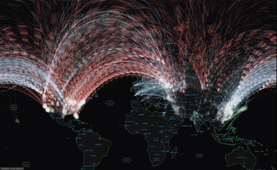
This is one of many posts on the subject of Great Arcs which ultimately lead us to the re-make of the 1983 cult classic Wargames in Tableau. I encourage you to read the whole series of posts by the wider team in addition to this one.

Why Arcs? … I say Why Not?

Beyond the why not and the fact that they are more aesthetically pleasing to the eye, I have found that the use of curves, arcs, etc. helps to significantly reduce over plotting when visualizing relationships between nodes (or cities). As an example, compare the below image to the header image, same data, same locations, same amazing Mapbox map created by Anya, only difference is the curves and that I got a little lazy with the colors below.

great arc 0.1

At this point if you are asking yourself what is a great arc (or great circle), please take a quick minute to go through this tutorial on the usgs.gov site. I found this walk through (embedded below) to be a very helpful explanation of the great arc concept with respect to our globe.

Now that we have answered the why, we should all say a big “thank you Alan Glennon!” Wherever and whoever you are out there, this post would have taken significantly more time to create if it wasn’t for the Python code you shared.

Here is Alan’s code posted in the linked thread…

great arc 1great arc 2

Once I stumbled upon this, I ported the math from Python to Tableau. In the spirit of leveraging the work of others, this post is based around the concept of you “copy and pasting” from my work to incorporate great arcs into your own Tableau workbooks. Outlined below are the steps that you will need to complete in order to make your own arcs.

Step 1: Get your data ready. Since we are building a map with paths (and also using one of my favorite tricks, data densification) we need to structure our underlying data accordingly. Sadly we cannot perform calculations on Tableau’s generated latitude and longitude, thus we need to source the coordinates in our data (see the note below on this). Here is what I am going to start working from for the purpose of this post.

great arc 3

Here are the steps we take (assuming you are in Excel) to prep our data. If you are planning to copy and paste the formulas from my workbook, please follow my field names exactly so you don’t run into orphan fields within the calculated fields.

  1. Add “Path” field with unique identifier for origin/destination combination (I am lucky and already have “ID”).
  2. Add “Path Order” field with value of 1.
  3. Copy the above two fields down your entire data set.
  4. Copy the entire data set (including the new fields) and paste it below itself with one blank row in between.great arc 4
  5. Update the second block of data to have path order value of 2.
  6. Delete the blank line between the two blocks (this is only there to keep track of where one block stops and the other starts).
  7. Sort the data by path and then path order. Your data should now look like this.great arc 5
  8. All columns are duplicated except for path order. This is what Tableau likes to see!

Note: Above I assume you have latitude and longitude field values in your data. If you don’t put your data into Tableau, have Tableau generate the latitude and longitude for each location. View the data in Tableau and then copy and paste that into Excel. You can then join the Tableau generated latitude and longitude back to your original data. Congratulations you just geo-coded your data via Tableau!

Step two: Bring your data into your Tableau workbook. Download and open a copy of my Tableau Public workbook embedded in the blog below. Go ahead and make a straight line map with path for comparison later… Here is mine

great arc 6

Step three: Now that you have your prepped data and a copy of my workbook ready to go, all that remains is copy and paste, creating a bin and some dragging and dropping.

  • Copy and paste the field “BezierValue” to your workbook.
  • Right click the “BezierValue” field and select create bin (make sure bin size is 1)
  • Next copy the following fields (I have them somewhat grouped in my workbook so it should be easy to do all of these at once. You may be tempted to copy all these fields with BezierValue, but trust me that it is easier to do BezierValue first, create the bin then copy and paste the rest of these. (See note below if you get errors on this step)

great arc 7

  • Make sure the gc_newlat_degrees has geographic role of latitude
  • Make sure the gc_newlon_degrees has geographic role of longitude
  • Drag gc_newlat_degrees to rows
  • Drag gc_newlon_degress to columns
  • Drag Path to Detail
  • Drag BezierValue (bin) to detail
  • Change mark type to line
  • Drag Bezier (bin) to path (make sure show missing values is enabled)
  • Size as small as possible, Transparency to something like 10%

great arc 8

And viola! There are now great arcs in YOUR Tableau workbook. I chose not to get into the math in this post, however, it is all in the workbook below and based on the python code I referenced in the beginning of the post. Feel free to dissect the math as much as your little heart desires.

Note: If you get an error on your fields when copying and pasting the calculated fields into your workbook it is likely due to your latitude and longitude having different names. You have two options here: (1) undo the paste, change your field names and paste again, or (2) update the ptlat_radian and ptlon_radian (and a few other) fields to point to your latitude and longitude fields respectively.

Wargames! (gifs courtesy of Allan Walker)

mercator wargames polar wargames

When I showed this to Allan Walker and Anya, we had a quick conversation around the correct use case to support the need for great arcs in Tableau. It did not take long for the group to land on the 1983 movie Wargames (of course!). So, without further ado, we give you Wargames in Tableau...

Enjoy!

The New Fabulous Mapbox Studio Tutorial - Making a more Accessible Map

Accessible-Map.png

**** Spoiler Alert****Spoiler Alert

After reading all this fabulousness you will be told that you can't use it in Tableau (fingers crossed *yet*)!  Please enjoy, and add "Mapbox Studio Tableau integration" to your list for Santa and be very, very nice!!!!!

Here is an example of how beautiful your new maps can be.  This one was designed to be a background map that was elegant and provided an alternate to just the black, white, and that other one that no one uses, that come pre-designed in Tableau.   Check it out live and zoom in and out.  Notice the color gradations as you zoom in close.  Those would have taken forever to get right in Classic, not to mention how amazingly smooth it is to zoom in and out and pan around.  This is a map Ferrari!

Tableau Light

For a great explanation of how Mapbox Studio is different from Classic check out this post.    Are you beyond excited yet?  No more Carto CSS!  Up with Mabox GL Styling!  Ready to rock?  Go to the recently launched Mapbox Studio and login.  Your Mapbox Classic login will work here as well.  Then click on the New Style button.

Create New Mapbox Style


Pick a style to base your new map on and click on Create.  I am going to modify a style to be more accessible for folks with color blindness, more limited visibility and dyslexia (a suggestion from Allan Walker).  I am going to use the Basic style, so select that if you are following along (or don't, I won't be hurt).

Create based on Style


Wait - what's this? Where is all that icky Carto CSS that was on the right side?  What is this new slick and glossy, Mapbox GL easy to use interface?  This is gonna be way fun!

New Studio Layout


One of my favorite features of the new Mapbox Studio is the ability to change multiple properties at once for things like colors and fonts all at one time.

Properties Fonts


I wanted to add a font that was accessible.  In addition to wanting to add high contrast and a larger size to my fonts, I also wanted to font to be readable by dyslexic people and so  chose to use a font called Lexie Readable.

Lexie Readable Font


In the new Studio, I can simply select the Font stacks property to see all the fonts grouped by Value (the name of the font face) or by the Property (the layers where they are used).  I am going to select By value and then click on the first Text font box where it is showing Open Sans Semibold.   Another window appears where I can now upload my new Lexie Readable font.

Change All Fonts


Once my font is uploaded, I can select it just like any of the pre-loaded fonts.  Go ahead and do so for each of the fonts Values.  You should then end up with only 2 Values as there is only a bold and regular version of the Lexie Readable font.

My New Font


Once finished, close up the properties window and zoom in a bit on your map and you can now see the updated font.  How easy was that!

Map with New Font


But remember, I wanted it to have a high contrast to make it easier to read, so now we are going to play with the Colors property.  Click on the little grey circle next to Text color and a big beautiful color picker shows up.  You can select a color or type it in by RGB or HEX.  You can also adjust the transparency (by changing the value to less than 100 to the percent transparency that you would like).  I am going to change mine to black.  Right below it is the Text Halo Color.  I am going to change that to be white for full contrast.

Change Color


The next thing I wanted to do was to make the text larger.  Really, I just want to do this to show off the amazing style by zoom level feature.  Click on Text field in the Properties, and then select the Style by zoom level icon in the Size area.  It will show you what zoom level you are currently in on the map and allow you to set sizes at different zoom levels.  It then beautifully calculates how the font should scale between the stops.  Let's bump ours up a bit to 16px at Zoom Level 3.  Feel free to increase the size on the other Text fields as well.

Style Text by Zoom Level


Now all your fonts should be a bit larger and easier to read for those of you who are like me and are starting to need readers for close up.  Onto color!  I wanted to adjust the colors to be more friendly to color blind folks  and found the below 7 color palette.

Color Blind Safe 7


With the new Classic, it is super easy to change colors all at once.  Go back to the Properties and select Colors and make sure the icon that looks like a trapezium is selected.  Notice the fill colors and a list of the layers that they are used in.  Click on the blue circle by the water and change it to R0 G114 B178 for Blue.  Next change the green used in landuse_park to be Blueish green R0 G158 B115.

Colors Zoomed Out


As I mentioned before, one of my favorite features is the style by zoom level and we can use that for color too.  Click on the little icon to the right of the green dot for landuse_park and Enable styling by zoom level.

Style Color by Zoom Level


You can use this to adjust the color at each zoom level, but in this case I will use it to adjust the opacity.  The value on the far right is showing that the color should be at 40% opacity from the get go, but gradually move to being at a 20% opacity by zoom level 22.  Make your changes and zoom in and out and see your magic!

Color Change Opacity by Zoom Level


Next let's learn how to add a pattern so that we can make our roads be dashed lines.  Giving different textures and patterns to map elements is another way to help differentiate layers and make them more accessible.  I am going to select my road_main layer.

Style Roads


I can create a pattern very easily by creating a Dasharray.  The first number is the size of the colored dash and the second is the space between your colored dashes.  My main roads are now all instantly updated to be dashed lines.

Style Roads Dashed Line


Another fabulous feature is the ability to multi-select layers and change them all to be the same.  For example, now that my road_major is dashed, I want to make m bridge_major and tunnel_major layers dashed too.   Using the Control  key (or command key on a Mac), multi-select all 3 major types  Notice now that several of the styling options say "Pick one".  Let's click the Pick one near the Dasharray.


Multi Select layers


It now give me the options to pick if I want to style them all like the road_major or like the tunnel_major.  I am going to pick the road_major so they will all have the dashed style.

Pick One


There is so much more to explore!  In just a few clicks you can create a beautiful, customized map to show off your data (hopefully in Tableau soon!) hopefully taking accessibility into account.

Happy Mapping!


Easy Peasy Lemon Squeezy Mapbox Maps and Layers in Tableau 9.2

Multiple-Layers-Tutorial2.png

One of the features that I am most excited about in 9.2 is the ability to add Mapbox map layers from the UI in Tableau instead of having to deal with all the .tms hackery!  If you are a beta tester for 9.2 and are publishing to Tableau Public, this is already available to you to use!  Ready to check out how easy it is now?  I’m going to use my Skyfall themed map to show off how easy it is to add multiple layers, and then we will create a “bog normal view swapper” (a very technical term that Allan Walker seems to use a lot).  This will allow the user to change the maps and layers in the background of your published workbook.

If you haven’t already, please read the previous 2 tutorials on:

  1.  Fast and Fabulous Custom Maps using Mapbox in Tableau where you will learn to create customs styled maps in Mapbox Classic that are so cool, that this one ended up in the Keynote on a jumbo screen in Vegas at #TC15.

SFGiants Mapbox Map in Tableau


2.  Create multiple custom map layers in Mapbox that you can toggle on and off in Tableau where you will learn to add and style your own shapefiles and create multiple layers.

Now that you know how to create fierce map styles multiple layers, let's look at how easy it is to add them in the new Tableau 9.2 UI.  For this example I will be using a map that I wanted to emulate the amazeballs UX in Skyfall created by Shaun Yuen.

Sky Fall Map

I wanted a background map that was similar, but then wanted to add multiple layers that had information on police and fire districts, transportation routes, etc. for a viz on SF Crime data that Allan, Jeff Shaffer and I were doing on the Tableau UX of the future.  My version is below:

Anya Skyfall

If you want to play along, then I suggest you go to Mapbox Classic and make a similar style.  To create mine, I started with the Mabox Style Dark and tweaked it with a lot of cyan (#OOFFFF) , a custom font called HyperSpace, and two custom grid patterns saved as a .png to make the water.  Go ahead.  I'll wait for you...

Anya waiting

Are you done yet?  Is it two am?  Did you down the whole bottle of wine?  Great!  Or if you were lazy and just went off to take a nap, you can always use mine  DataBlickSkyfallBlue.tm2  Let's continue.  Once you publish your new fancy pantsy map, be sure to copy and paste your Map ID into a text editor for easy access later.  You will hopefully have a few of these by the time we are done, one of each layer you want to show and be able to turn on and off in Tableau.

save map id

Next we are off on the hunt to get some fun layers to add.  I got most of mine from SF Open Data.

download shape files

In my case I downloaded Muni, Ferry, Rail, LifeLines, Fire Districts and Police District shapefiles.  Each one will be it's own layer in Tableau, so I can toggle them on and off depending on the type of crime incident I am analyzing.  This was the dashboard created by Jeff Shaffer which had streaming information from several services.  Ideally, as a crime was being called in, the map layers could be triggered by keywords, so that only relevant layers would show based on the situation and context.  We aren't quite there yet :-).  It also was featured by WTF Viz which really made us laugh because it was supposed to be ridiculous (and included a 3D pie courtesy or Mr. Rediculous himself, Noah Salvaterra).

Police Dashboard

So after you have uploaded your shapefiles to Mapox, styled them, and then uploaded your styles, write down the Map ID of each of your layers.  You did read the other tutorials right?  Okay, fine.  Here is the short version of it:

Add a new dataset

Upload data

Browse to and upload you shapefiles.  I love the little people that Mapbox has to guide you.  They really remind me of the "Dumb Ways to Die" video.  Go take a break and watch it if you like.  I am hoping that Mapbox makes t-shirts and stuffies with their characters (and send me some, hint hint).

Upload

Grab their Map IDs!

data id

Create a new style based on your Map ID.  You can put multiple layers together in Mapbox, but we want to be able to toggle them on and off in Tableau.

new style

Style away to your hearts delight.  Remember that these layers are going to go on top of your base layer (the Skyfall one) so you want to make sure they are transparent except for the shapes or whatever else you are wanting show off in the layers.  Mine for the Fire districts is very basic.  Once again, grab the Map ID from your layer style and add it to that text file where you pasted the one for your base layer.

styled shape id

Rinse and repeat, until you have all of your layers styled and ID's in hand.   It's finally time to go play in Tableau!  You should have a list in your text editor like this:

Your Access Key from your Mapbox account:

  • pk.eyJ1IjoiZGF0YWJsaWNrIiwiYSI6IjM5anE0eTQifQ.XfwI7Wcu7EFKoXXXXXXXX

Your styled layer IDs:

  • Skyfall  datablick.2986XXXX
  • Muni     datablick.a586XXXX
  • Ferry    datablick.bcb0XXXX
  • Rail      datablick.77cXXXX
  • LifeLines   datablick.0798XXXX
  • Fire Districts   datablick.8b59XXXX
  • Police Districts  datablick.56b1XXXX

Open a new workbook in Tableau 9.2 (version 3 at the time of this post), and pick a data set.  You could have downloaded the crime data while you were on the SF Open Data site, but if you didn't, SuperStore will work just fine.  Add a geographic dimension and a metric.  Then go to your Map menu and select Background Maps, and then and select Map Services.

mapservices


Click on the add button and then, there it is!  WOOT!  The magic Mapbox Maps button.

Mapbox Maps Option

You can easily wuss out and use one of the pre-made Mapbox styles, because they are fabulous, but then we would have just wasted all that time, and we are almost done!

Mapbox Pre-made Styles

Instead get ready to copy and paste like a madwoman!  You have to do the ID's one at a time.  When you are done, you should look something like the below.  The order is important as the layers will appear in that order in Tableau.  I put the Skyfall base map at the top.

adding layers in Tableau

Go back to the Map menu and your beautiful new, multi-layered map will now be in your list of background maps!  Go ahead.  Select it!

Turn Your Map On

To play with your layers, you will have to go back to the Map menu one more time and select Map Layers.  You will now see them listed on the right.  Turn them on an off.  Party!!!!

Toggle Layers

Now for some extra fun.  Allan discovered this about 10 seconds after being given 9.2 with this feature enabled.  Go back to your Map menu and select Map Services.  highlight your new map and click the export button.

Export your tms

You will now be prompted to save a copy in your Mapsources folder, and after you do, you will be able to use this map in any viz of your choosing!  If you needed to really cheap out for the holidays, you could give your .tms to all your friends and family!  Better than fruitcake, right?  I might swoon for a fella with a hella cool map .tms.  Just sayin'.

export tms two

Super happy yet?  One thing that would be really cool would be to allow the users to switch the layers on an off once the viz was published.  I'm still hoping for that, but for now, we need to build a "bog normal view swapper".  This will allow the user to select a pre-defined combination of layers using a parameter drop down in the front end.

The first step is to make a parameter and add a descriptive name to the layer views.

Parameter

Create a Calculated field that is just that parameter.

calculated field

Then put that new Dimension onto the Filters shelf.

Filter

For our first view, we can just leave the default, the first value in the Parameter list.  Back on your sheet, make sure only the base map and Ferry layers are enabled.  Change the name of the sheet to Ferry.

Ferry

Duplicate a sheet for each of the categories listed in your parameters and toggle on only the relevant map layers.  Change the filter on Map Layers on each sheet by removing the filter on Ferries, and using a custom value type in that matches the category in your parameter list.  So for Muni, I would type in "Muni" and click the plus sign to add it.  Click okay.  WTF?  Where did my viz go?  Chillax.  You just need to show your parameter control and change the value in the drop down to pick Muni.

Show Parameter Control

Whew.  Your viz is back. Repeat for each of the other sheets until you have one sheet for each map layer combo you want the users to be able to pick from.  Then we get to add them all to a dashboard.  After creating new dashboard, add a vertical layout container.  Then drag each of the sheet into that container, make sure they fit the Entire View,  and hide their titles.  As soon as you hide the titles, they will magically disappear except the map that has the filter associated with the current parameter selection.  Add your parameter control to the dashboard so the user can select which layers to show.

Multiple Layer Dashboard

Style it all a bit more and publish away to Public!  How amazing are you!  Go out to a restaurant or bakery and treat yourself to a totally decadent desert and coffee!  You deserve it!

Radial Trees in Tableau by Chris DeMartini

Radial-Tree-Feature-Image1.png

Before we get into it, I wanted to include a shameless plug for my fellow DataBlick'ers upcoming sessions at the Tableau Conference. Be sure to check them out if you are heading that way!


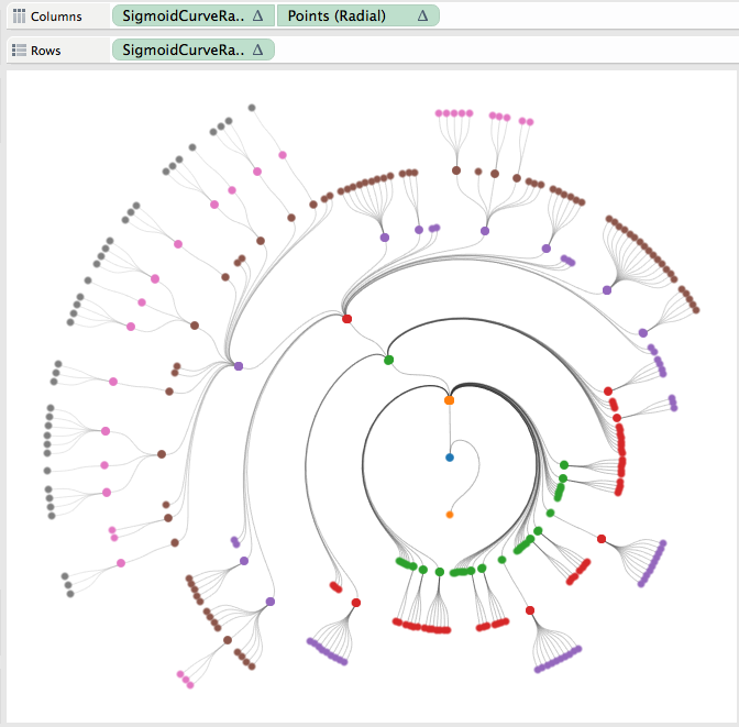
This is an incremental post to navigating your family tree from a few months back. This builds off of that visualization technique to manipulate the tree into a radial view. Also, as with the original, the tree is 100% dynamic and you can reset each node in the tree as the root node, toggle between tree views as well as change the API you are analyzing.


What is the benefit of a radial tree? As I discussed in my recent Tableau Fringe Festival presentation, it is really a give and take. Overall, it is probably easier to follow a path through a horizontal/vertical tree diagram. However, as your data volume and hierarchy levels increase, you will ultimately run out of space on your screen. That is where the radial tree can add value. With the root node as the center of the viz, and each level of the hierarchy increasing in diameter, you ultimately have more viz real estate to work with as you dig deeper into your hierarchy.


The use case I leveraged for this post is taking a look at the Tableau JS API class/object structure. I chose this in order to more easily navigate the Tableau JS API objects available to us all. I also incorporated the Flare API class structure for comparison purposes. Lastly, this effort was inspired by a similar D3 implementation.


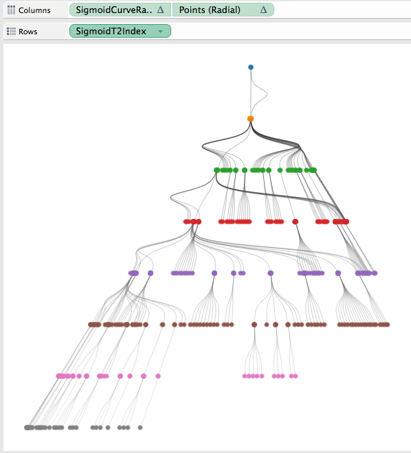
To arrive at the radial tree, I started with the vertical hierarchy tree, a carbon copy of the family tree post discussed above. From this point it was just a matter of taking this tree and manipulating it into a circle. Honestly, I spent way more time than needed trying to figure out how to do this with a whole new set of calculations. If it is not broken, don't fix it! Once I settled on leveraging my existing tree and just manipulating it into a radial version, I needed a total of five additional calculated fields to bend my vertical tree into a radial tree.


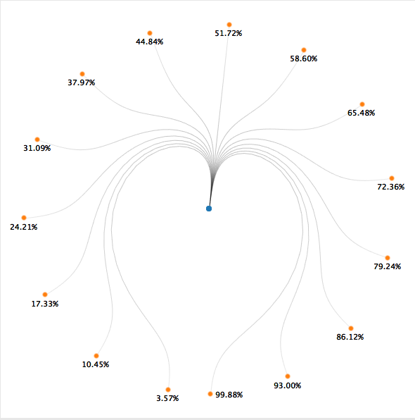
Calculation 1: A window table calculation to apply PI() across our data densification technique.

Radial Tree Pic 1


Calculation 2: A level of detail calculation that will return the maximum node placement across the entire population. This result is than applied to the same table calculation as our other fields. LOD made this so much easier!

Radial Tree Pic 2


Calculations 3 and 4: This is the trickiest part. Leveraging our previous sigmoid curve function we are going to create x/y coordinates in a circle. One of the main things we need to know is where our points are in relation to one another. To figure this out, I used a percentage of maximum node technique. This is best described by the below images and I once again leveraged the handoff-map created by Joe Mako.

Radial Tree Pic 3aRadial Tree Pic 3b


In this example the left most node is closest to 0% and the right most node is closest to 100%. We adapt that to a circle implementation shown on the right, via the below calculations.

Radial Tree Pic 3c

Radial Tree Pic 4

Quick side note: While in the process of implementing these fields, I came across this result, not very meaningful, but reminded me of star wars a bit…

Radial Tree Pic 5


Calculation 5: This last calculation is just an adaptation of Jeffery Shaffer’s “Points” calculation, leveraging our radial field created above instead of our linear field.

Radial Tree Pic 6

From here we just need to place the respective calculations on their corresponding shelves and we now see our radial tree! Compare the two versions below and you will note identical use of our rows/columns shelves (inversed) between the two implementations.

Radial Tree Pic 7aRadial Tree Pic 7b

There have been a couple requests for the underlying excel files, you can download them here.

Alteryx Newbie Creates Dynamic Parameters in Tableau First Day by Jonathan Drummey

I am delighted and beyond honored to announce the first DataBlick post from the famed Jonathan Drummey.  In his first few hours following an introduction to Alteryx training he came up with an elegant solution to dynamic parameters in Tableau as described below.  Go Jonathan!

First, watch this 4 minute video on what an Alteryx newbie (yours truly) just did:

https://vimeo.com/jonathandrummey/alteryx-newbie-creates-dynamic-parameters-in-tableau

How this Came to Be

Yesterday most of the DataBlick staff were at an Alteryx training with friend Allan Walker:

https://twitter.com/datablick/status/637283689173377025

Though he's already and Alteryx Ace, Joe Mako was there to help us Tableau users make the translation to Alteryx and see what else he could absorb, and Allan Walker was there to sit in the corner working on his laptop and occasionally giggle like a schoolboy. (I think we'll get to see what he was up to at the Tableau Conference).

As I learned more about Alteryx through the day I came away incredibly impressed at its capabilities as a visual environment for manipulating & transforming data along with the attention the Alteryx developers have had for the "meta" aspects of working with data: we can visually inspect every step of the Alteryx pipeline and rewrite if need be, and we have the tools to build our own pipelines from the ground up.

I wanted to take Alteryx out for a drive to see what it could do and decided to look into the Tableau XML, in particular using Alteryx to dynamically update Tableau parameters. This is something I've worked on before (see Creating a Dynamic Parameter with a Tableau Data Blend) and last year at the Tableau Conference Bryan Brandow & Andy Kriebel demoed a solution that they'd built for Facebook with the same basic idea as my Alteryx one. The particular use case is one of the most requested ones for dynamic parameters, namely updating the parameter list as the data changes.

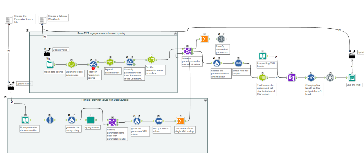
This morning I built a demo Tableau workbook and started building an Alteryx workflow. With about 5 hours of effort I learned some regex, figured out Tableau's XML structure, learned Alteryx's XML Parse tool, learned how to build an Alteryx macro, constructed the configuration file, built two Alteryx macros, and had a working prototype of a tool that opens up the Tableau workbook XML, queries the data source for the latest values of the selected parameters, and then writes out the new values to back to the workbook:

Screen Shot 2015-08-29 at 10.54.50 PM

One note on the configuration of this - besides the necessary parameter data source file that I described, the Tableau parameter has a comment field that indicates which query to pull data from:

Screen Shot 2015-08-29 at 11.23.59 PM

Now, I did have one advantage over your average Alteryx newbie and that is having Joe Mako in the room here at DataBlick HQ. I was pretty determined to build this myself, and at the same time I had some regex difficulties and building Alteryx macros were completely new so his help saved time reading help files and running Google searches. Thanks, Joe!

The macro is really a version 0.1 proof of concept, I haven't tested it out on multiple parameters in the same workbook, it issues more queries than it needs to, it only handles .twb files and not .twbx (Tableau Packaged Workbooks), and really needs to take advantage of Tableau's REST API so we can download all the workbooks at once from Tableau Server to update the parameters & republish them. And I must make the obligatory caveat that rewriting the XML is  totally unsupported by Tableau so if your workbook breaks then you're on your own. And maybe this'll all be moot depending on what Tableau announces in October. But in the meantime we've got yet another way to get more utility out of Tableau, I've got some updates to make, and I've got a whole bunch of new knowledge available to help out more people.

Here's the macro if you want to take a look at it yourself: update Tableau parameter v0.1.yxzp

DIY Chord Diagrams in Tableau - by Noah Salvaterra

ChordHeader-e1440547931783.png

I am beyond excited to introduce the first (and amazing) "how to" blog post from DataBlick Partner Noah Salvaterra on the DataBlick site! In addition to working full time with clients, Noah has been instrumental in creating some of our unique service offerings, such as the Tableau Personal Training Program, and a Virtual Center of Excellence Program that we hope to announce by TCC15. If that wasn't enough he also recently lured both Joe Mako and Jonathan Drummey to the DataBlick team.

Noah has been called "ridiculous", for his ability to make just about anything happen in Tableau, as readers of Jonathan Drummey's Drawing with Numbers have already seen. This post is no exception. I knew this was cooking, and my jaw still dropped.

Thank you Noah!

-Anya