Radial Trees in Tableau by Chris DeMartini

Radial-Tree-Feature-Image1.png

Before we get into it, I wanted to include a shameless plug for my fellow DataBlick'ers upcoming sessions at the Tableau Conference. Be sure to check them out if you are heading that way!


This is an incremental post to navigating your family tree from a few months back. This builds off of that visualization technique to manipulate the tree into a radial view. Also, as with the original, the tree is 100% dynamic and you can reset each node in the tree as the root node, toggle between tree views as well as change the API you are analyzing.


What is the benefit of a radial tree? As I discussed in my recent Tableau Fringe Festival presentation, it is really a give and take. Overall, it is probably easier to follow a path through a horizontal/vertical tree diagram. However, as your data volume and hierarchy levels increase, you will ultimately run out of space on your screen. That is where the radial tree can add value. With the root node as the center of the viz, and each level of the hierarchy increasing in diameter, you ultimately have more viz real estate to work with as you dig deeper into your hierarchy.


The use case I leveraged for this post is taking a look at the Tableau JS API class/object structure. I chose this in order to more easily navigate the Tableau JS API objects available to us all. I also incorporated the Flare API class structure for comparison purposes. Lastly, this effort was inspired by a similar D3 implementation.


To arrive at the radial tree, I started with the vertical hierarchy tree, a carbon copy of the family tree post discussed above. From this point it was just a matter of taking this tree and manipulating it into a circle. Honestly, I spent way more time than needed trying to figure out how to do this with a whole new set of calculations. If it is not broken, don't fix it! Once I settled on leveraging my existing tree and just manipulating it into a radial version, I needed a total of five additional calculated fields to bend my vertical tree into a radial tree.


Calculation 1: A window table calculation to apply PI() across our data densification technique.

Radial Tree Pic 1


Calculation 2: A level of detail calculation that will return the maximum node placement across the entire population. This result is than applied to the same table calculation as our other fields. LOD made this so much easier!

Radial Tree Pic 2


Calculations 3 and 4: This is the trickiest part. Leveraging our previous sigmoid curve function we are going to create x/y coordinates in a circle. One of the main things we need to know is where our points are in relation to one another. To figure this out, I used a percentage of maximum node technique. This is best described by the below images and I once again leveraged the handoff-map created by Joe Mako.

Radial Tree Pic 3aRadial Tree Pic 3b


In this example the left most node is closest to 0% and the right most node is closest to 100%. We adapt that to a circle implementation shown on the right, via the below calculations.

Radial Tree Pic 3c

Radial Tree Pic 4

Quick side note: While in the process of implementing these fields, I came across this result, not very meaningful, but reminded me of star wars a bit…

Radial Tree Pic 5


Calculation 5: This last calculation is just an adaptation of Jeffery Shaffer’s “Points” calculation, leveraging our radial field created above instead of our linear field.

Radial Tree Pic 6

From here we just need to place the respective calculations on their corresponding shelves and we now see our radial tree! Compare the two versions below and you will note identical use of our rows/columns shelves (inversed) between the two implementations.

Radial Tree Pic 7aRadial Tree Pic 7b

There have been a couple requests for the underlying excel files, you can download them here.

Navigating your Family History in Tableau by Chris DeMartini

Context

A while back, I was talking to my mom about one of her passions, tracing the history of our family lineage. She has spent more time on this than I can really comprehend at this point and has traced our family all the way back to the 1600s (cheers to you mom!). During the discussion I asked her to show me my ancestor tree. She said no problem, and then printed out 23 pages of paper containing my ancestor tree, which she then taped together and laid out on the floor shown below.

Family Tree Pic 1

This does show my family tree, but I wondered if I could help my mom out with the following challenges presented by her genealogy software’s reporting limitations:

  • Generating the tree was a time consuming process. She had to print, tape and then find a place large enough to view the tree.
  • The size of the tree is not conducive to review, you literally have to walk several feet to review it (which is why you see my left foot twice in the above picture). Also, looking at more than one tree at a time would be extremely difficult and take up most of the floor space in the house.
  • The tree was static. She had to select a root, direction (ancestor/ descendant) and then print, tape, etc. Then repeat this for each root from which she wanted to view lineage.
  • Information was limited to what could fit in the box allocated to each person in the tree. The tree was 1 dimension, additional context cannot easily be added or modified.
  • And let’s face it, the tree print out is not very tree friendly (pun intended).

So, now that we know what we are trying to fix, how do we go about this. Obviously, I immediately started to see the value that Tableau and its interactive nature could bring to my mom’s research. We can address all the issues mentioned above just be leveraging Tableau’s native functionality and a few tricks.

The Viz

We are going to build two tree views in Tableau, an ancestor view and a descendant view of a dynamically selected root person. Within this post I will walk through building the ancestor tree (a binary tree), feel free to reach out if you want more information on how the descendant tree was built, but will leave that to the imagination for now.

First things first, the credits. I started this effort with two main inputs, (1) the node tree link diagram that was explained and created by Jeffery Shaffer and (2) the dynamic parameter posts that Nelson Davis recently went through. I rely on both of these to get to the family tree viz shown here. In addition to these, I also asked Allan Walker, Noah Salvaterra and Anya A’Hearn for general help and guidance along the way. Also, thanks again for lending your blog Anya!

Quickly on the underlying data format. For the most part it is the same overall setup as shown in the Hive plot post. Refer back to that (or the workbook itself) to dig into how the underlying data has been structured to support the visualization shown here.

One of the most important aspects of building the viz is how to place the various nodes within the viz. From there we will leverage Shaffer’s node tree link diagram with a tweak to place the curved lines in between our nodes. Everything will be based from the root node and built up or down from there.

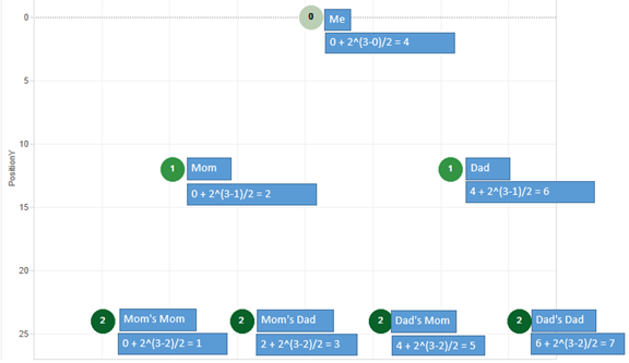
Onto to node placement already! The Y-axis of the node placement is simpler for this use case. We are going to assign a Y value based on the node’s generation. Root node is generation 0, parents are generation 1, and grandparents are generation 2 and so on. Then in order to leverage Shaffer’s curve equation for our tree we multiply the generation by 12.

Family Tree Pic 2

Now the hard part, where do we put the nodes on the X-axis. I have two solutions for this, one for ancestor where we have two and only two parent nodes and another for descendants where we have 1 to N child nodes. As mentioned, we will walk through the ancestor tree view in this post.

When examining the ancestor tree, we see that each generation has two to the power of N worth of nodes. For example:

  • Generation 0 (Root Node) is 2^0 = 1 node
  • Generation 1 (Root’s Parents) is 2^1 = 2 nodes
  • Generation 2 (Root’s Grandparents) is 2^2 = 4 nodes
  • Generation N is 2^N nodes

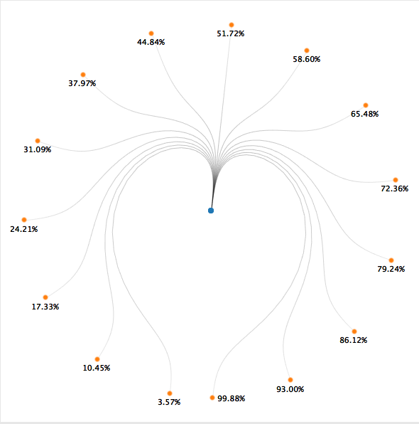
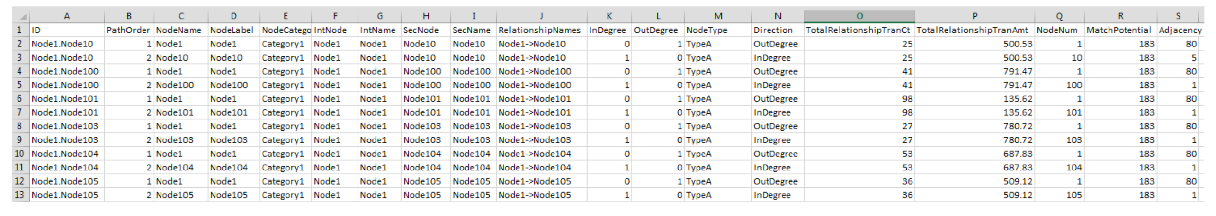
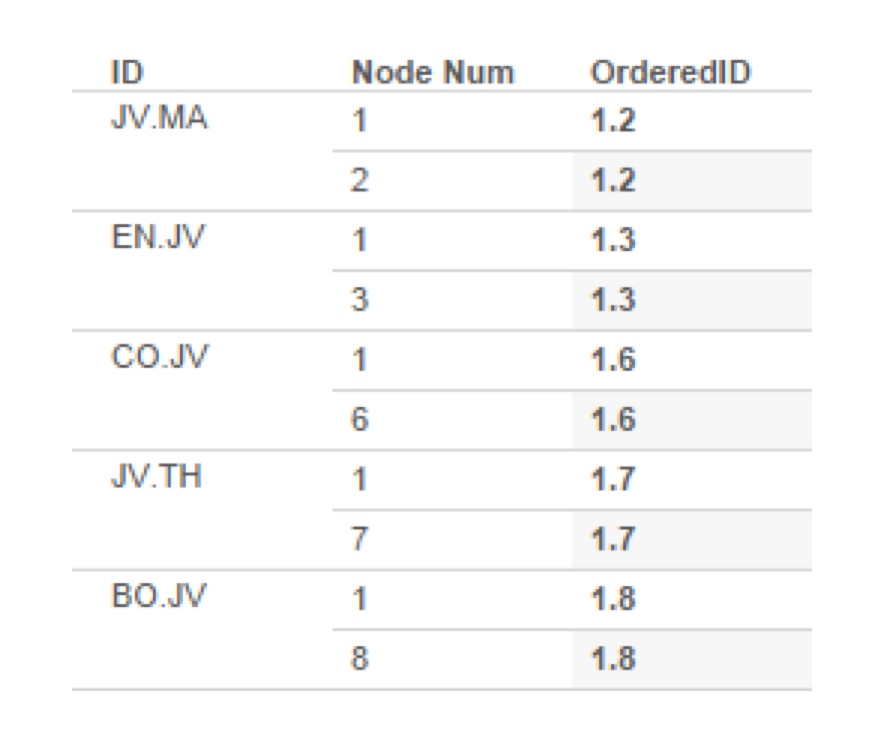
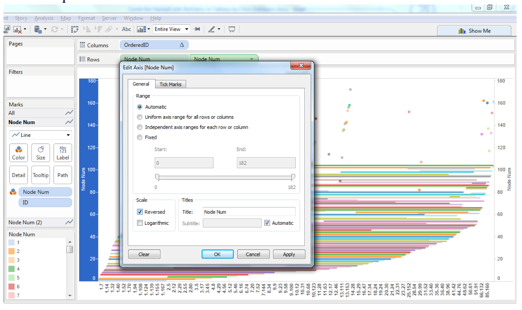
So our tree width needs to increase by this factor as we continue to add generations to the tree. I also enforced a rule that all females will be on the left side and all males will be on the right. As a result of this rule, we need to keep track of how many males are in the lineage of the specific node we are trying to place. Here is a table breaking down how I went about the calculation for Position X. Disclaimer: the [XPosStart] and the generation counter ([A]) were both created outside of Tableau using a recursive CTE in SQL Server (reach out if you want the nitty gritty on this). If you have successful feedback on the way to implement this recursive calculation step in Tableau, I’ll have a beer waiting for you at TCC15. I am sure it can be done, but faster for me in SQL Server.

Family Tree Pic 3

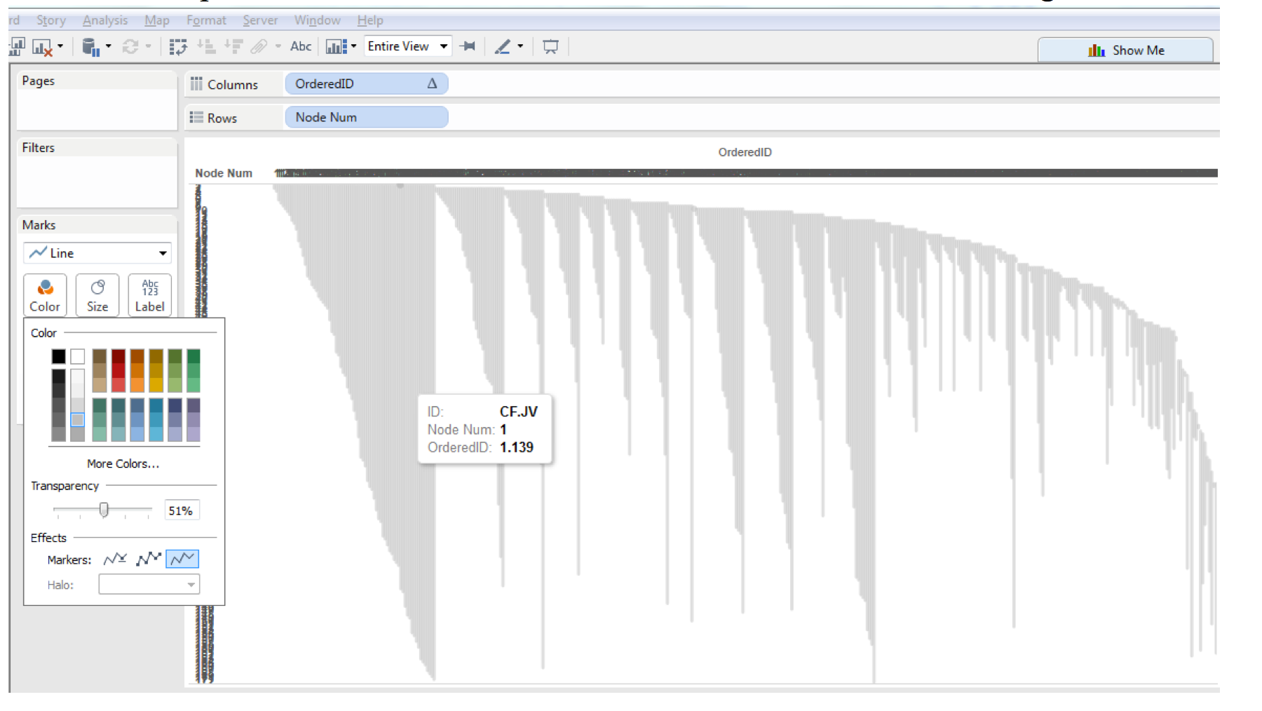
Placing Position Y on rows and Position X on columns your view should now look something like this, the nodes have now been placed in the tree structure (also showing the Position X calculation again for each node).

Family Tree Pic 4

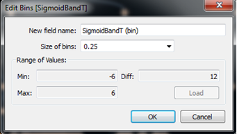
Onto the curves we go. First thing we need to do is add a bin field to generate the path of the curves. We have a field (SigmoidBandT) that is -6 for starting point and 6 for ending point of a node relationship. We bin this field by 0.25 to densify the data and execute the curve equation (make sure show missing values is selected!).

Family Tree Pic 5

When using data densification, we have to be sure to leverage window aggregates for all of the relevant coordinate fields which are needed to drive curve calculations. The start/end points for X and Y coordinates are shown below. One key note is to leverage the FIRST() and LAST() functions to make sure you are only referring to either the start or end point of your paths respectively.

Family Tree Pic 6

Now that we have our bin and windowed coordinates we can build our curves from our parent to child nodes. This is done with two equations (which I found in Shaffer’s node-link tree diagram) shown below, Sigmoid Curve and SigmoidT2Index. One other key field in the formulas is Sigmoid Function, this actually does the math behind the x-value of the curve. (Refer to the work book for the additional calculated fields nested within these formulas.)

Family Tree Pic 7

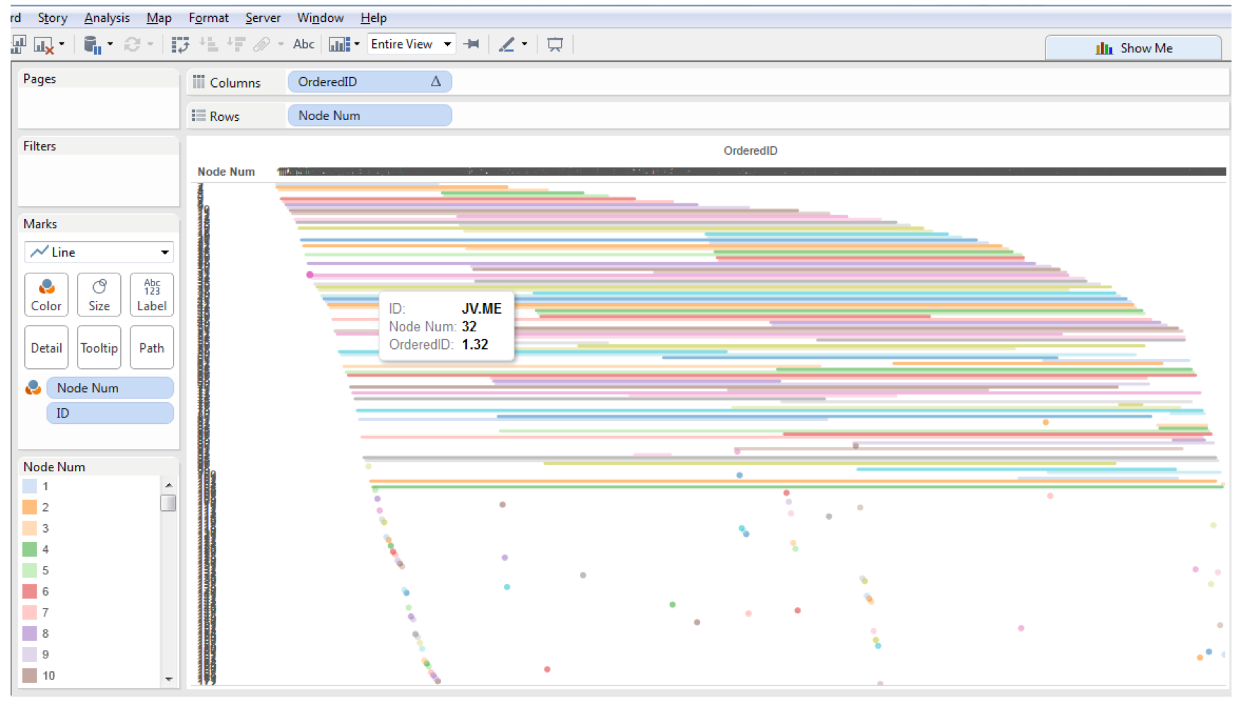
We replace the rows and columns shelf with the fields mentioned above and place the bin (showing missing values) and path fields on the detail shelf, and we now have curves.

Family Tree Pic 8

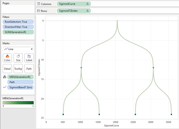
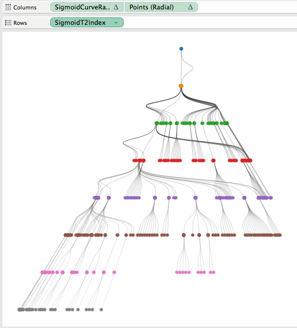
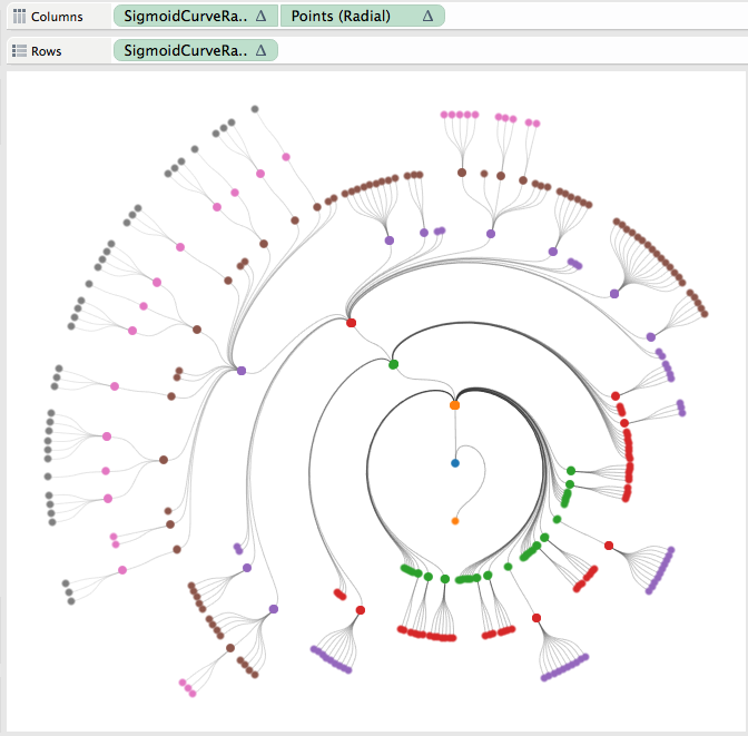
One very useful thing that I got from Shaffer’s post was how to do the dual axis when using curved lines. He created a field call Points which is a table calculation that only has a value on the first or last value of a group. I did have to add Node to the detail shelf for Points to work correctly, here is the equation and the updated tree result (now looking a lot like a red-black tree).

Family Tree Pic 9

One last requirement we need to meet is the ability to drill through on any node in the view and see the ancestor or descendant tree from that specific node’s perspective. Here we will leverage the URL action “hack” that Nelson Davis recently blogged about here. Take a look at the details he posted to get a great overview of how this process works and the various pieces of the URL string required for this to work. In addition to this, the other step I had to take was to “cache” the data for the ancestor/descendant tree views having each node as the root. This data preparation work was done in SQL Server in this example and is only required since Tableau Public has limited data connections allowed and data extracts required. You can take advantage of live connections to get around this additional caching step and generate the tree on the fly within your data connection configuration.

So I added two dashboard actions, one for ancestor and one for descendant which use the above mentioned URL trick to hack “dynamic” parameters driving the root node and direction of the tree view. This sends the selected node to our root node parameter and also sends the direction to our direction parameter. Here is an example of the URL action string, I have highlighted the root node and direction parts in green below …

https://public.tableau.com/views/FamilyTree/FamilyTree?:showVizHome=no&:embed=y&:tabs=no&:linktarget=_self&RootNode=<NODE>&DirectionParm=Ancestor

Here is what the URL action menu looks like within the viz…

Family Tree Pic 10

Now, when working on public, we can select any node in the viz and then reset the tree view to either the ancestor or descendant view. Here is the result of selecting ancestor and then descendant views for my grandma on my dad’s side…

Family Tree Pic 11

There are bits and pieces that I have left out of this post to try and keep it from getting too long (still totally failed at that goal). These can all be reverse engineered from the workbook provided or free feel to ping me at @demartsc with any questions. 

Mom – I hope you find this helpful!

Comb the Hairball with BioFabric in Tableau by Chris DeMartini

Screen-Shot-2015-05-09-at-9.43.24-PM.png

Yet another amazing guest post by Chris DeMartini showing amazing options for visualizing for network graph data in Tableau.  I am particularly fond of this one and already have users chopping at the bit to visualize their data this way.  Thank you Chris!

Recently I posted about creating circular and hive plot network diagrams using Tableau and a question was posted around whether we could also execute the BioFabric network graph within Tableau. There is a lot of additional information about the BioFabric network graph at their website. The super-quick demo is a good intro to the graph if you have not seen it before.

The answer to the question posted is yes and this post is designed to walk you through the steps needed to build your own BioFabric graph within Tableau.

First things first the data. I used the same underlying data structure that supported the hive plot network post mentioned earlier. However if you want to save a click, here is a screen shot of what that data looks like. Screen Shot 2015-05-12 at 10.34.45 PM

I also obtained network data generated from Les Miserables, and reformatted the data to match the above structure. Here are the main aspects of the underlying source data requirements: Each edge (relationship between nodes) should have 2 records representing the output node and input node of the edge. Nodes have been numbered based on their degree of adjacency, ordered from highest degree node to lowest degree node. For example node 1 has the most edges, node 2 the second most, etc. My ID field is a combination of the edge output and input nodes separated by a period (e.g. AM.GP is the ID for the edge between nodes AM and GP). This is the identifier for an edge. I also added relationship count which is the number of instances that this specific edge exists in the network.

The above captures the main concepts of the underlying source data, but do review the data within the viz if you want further details.

Onward we go to BioFabric! According to their site (see Significant Features section) I noted the following: Edges are represented as one-dimensional vertical line segments, one per column, terminating at the two rows associated with the endpoint nodes. Nodes are represented as one-dimensional horizontal line segments, one per row. Edges are drawn darker than nodes; this has the effect of emphasizing the links and making them appear to float in front of the nodes. Edges are unambiguously represented and never overlap. Note: There are several other meaningful points in this section of their site, however I am going to focus this post on the ones described above.

Where do we start? Let’s get going with getting edges to show up as vertical line segments.

We need a calculated field which I named “OrderedID.” This field was created to address the placement of edge line segments on the X axis. The thought here is to ensure that edges are ordered and grouped based on the degree of their nodes. We want the edges ordered by node degree as follows: edge 1.2 should be before 1.3 which is before 1.10 which is before 2.3 which is before 5.2 and so on. I used the following table calculation. Screen Shot 2015-05-12 at 10.34.53 PM

Which results in this value for the OrderedID field (regardless of edge direction this will place the higher degree node first and the lesser degree node second, assuming node number is ordered). You can play around with this equation (and node number) to modify the placement of your edge segments on your viz. Screen Shot 2015-05-12 at 10.35.07 PM

So now we need the Y axis for our vertical lines, this is simply going to be node number. So we drag OrderedID to Columns, Node Number (a dimension in my data) to Rows and make sure that ID is placed on the Detail shelf. Screen Shot 2015-05-12 at 10.35.12 PM

Then we change mark type to line, change view to “Entire View”, change color to gray and 50% transparent and remove markers from lines and we have vertical edge lines! Screen Shot 2015-05-12 at 10.35.18 PM

Next we need to get the horizontal node lines and color by node. I first did this on a separate sheet by making a copy of the above sheet. On that copy we then drag node number onto the color shelf and we now see the below. Screen Shot 2015-05-12 at 10.35.22 PM

Sweet! We have one sheet with vertical edge line segments and one sheet with horizontal node line segments, now let’s just put them together right?

One issue you will run into at this point is that Node Number is a discrete dimension, we need to do a dual axis and in order to make that happen we need to convert Node Number to a continuous dimension, after making that change and executing and synchronizing the dual axis we see this… Screen Shot 2015-05-12 at 10.35.28 PM

Looks OK, except it is upside down. To fix that we just edit the axis and click the reversed option box. Screen Shot 2015-05-12 at 10.35.33 PM

Now we are right side up again and we need to make a few last changes to combine the two sheets into one view. Here are the steps I took… On the second Y Axis (vertical edges) Drag Node Number from Color to Path Adjust gray color darker or lighter as desired, I used 75% transparency Make sure line size is as small as possible Make sure the second Y axis is in front of the first Y axis Make sure line markers are off Adjust tooltip to you requirements (note: dimensions need to be brought in as attributes to keep from effecting the line paths and table calculations) On the first Y Axis (horizontal nodes) Make sure line size is as small as possible Make sure line markers are on for all points Adjust color transparency as desired, I used 60% Adjust tooltip to your requirements (same rules apply)

Once you have adjusted the Y axes as you want, you can then hide all of your headers from all of your axes, and now we have a BioFabric! Screen Shot 2015-05-12 at 10.35.38 PM

At this point, you can play around with colors, ordering of nodes, grouping of nodes etc. to change the look and feel of the graph. There are some other rulesets which I did not focus on listed at biofabric.org and with some additional work we could probably incorporate those as well.

Hope you find the post and graph type useful, and thanks again for sharing your blog Anya!

Sources: Biofabric.org (graph type source and explanation) https://github.com/mmlc/lesmiserables-character-network (les miserables data)

Circular and Hive Plot Network Graphing in Tableau by Chris DeMartini

17-Hive-3.png

I am delighted to host a guest blog post by Chris DeMartini on Network Graphing and Hive Plots on the fly in Tableau!  From Chris:

First off, want to send a big THANK YOU to Anya for the generosity and help she has provided, really for no reason at all, other than the fact that she is awesome and we are both San Francisco Giants fans.