A Tableau Accessibility Journey - Part IV - Keyboard Accessibility

This post is a continuation of A Tableau Accessibility Journey - Part III - Color Contrast, earlier posts in the series outline the scope of the work we are covering as part of this effort. Part I of this series also includes a number of accessibility issues that were identified in our case study visualization, one of which was the inability to navigate and interact with our case study visualization without a mouse.

Read More

A Tableau Accessibility Journey - Part III - Color Contrast and Font Size

A Tableau Accessibility Journey - Part III - Color Contrast and Font Size

This post is a continuation of A Tableau Accessibility Journey - Part II, which discusses how to set focus order correctly in your Tableau visualization. The first part of this series includes a number of accessibility issues that were identified in our case study visualization, and this post will focus on trying to address the issues of color contrast and text size identified in part one.

Read More

A Tableau Accessibility Journey - Part II - Focus Order

This post is a continuation of A Tableau Accessibility Journey - Part I, which outlines the scope of the work to be covered in this series. The first part of this series includes a number of accessibility issues that were identified in our case study visualization, and this post will focus on trying to address this issue of Focus Order.

Read More

A Tableau Accessibility Journey - Part I

A Tableau Accessibility Journey - Part I

Recently, I came to the realization that 0 of my 58 published data visualizations on my Tableau Public profile provide equal access of their data and storylines for all users, mostly excluding those with disabilities. I have read and studied a lot about developing visuals with care for color blindness, but not so much for blindness itself, or low vision, or users who cannot use a mouse, or many other disabled users. A recent Twitter thread by our colleague Frank Elavsky hits on this topic. It is through these realizations that I decided to join and contribute to the dataviza11y group. A quick plug that we have a great group of people, looking to do some exciting things in this space, so do check out and follow that group and it’s member’s activities if you are interested. A wonderful and recent example is the talk Frank, Sarah Fossheim and Larene Le Gassick presented at Outlier.

Read More

How to avoid spaghetti bowl Alteryx to create readable workflows

How to avoid spaghetti bowl Alteryx to create readable workflows

What is an Alteryx spaghetti workflow?

I’m frequently asked to look over other people’s Alteryx workflows, and it feels like looking at a bowl of spaghetti. The connector lines go every which way, tools are placed haphazardly on the Canvas, and I have to start clicking on tools to try to see what they are contributing to the data flow.

Read More

Feeding the screen-time beast with shifting mobile metrics

Feeding the screen-time beast with shifting mobile metrics

There are a lot of helpful hints on modifying desktop dashboards into mobile ones. They tend to focus on altering the layout to be tall and being mindful of finger-based interactions. I feel they forget one critical aspect - users don’t actually want to look at dashboards on a mobile device. Now with that blasphemous statement out of the way, let’s get on to what users on mobile do want, an analytics app that serves up relevant content that is engaging, useful, and quick to digest on the go.

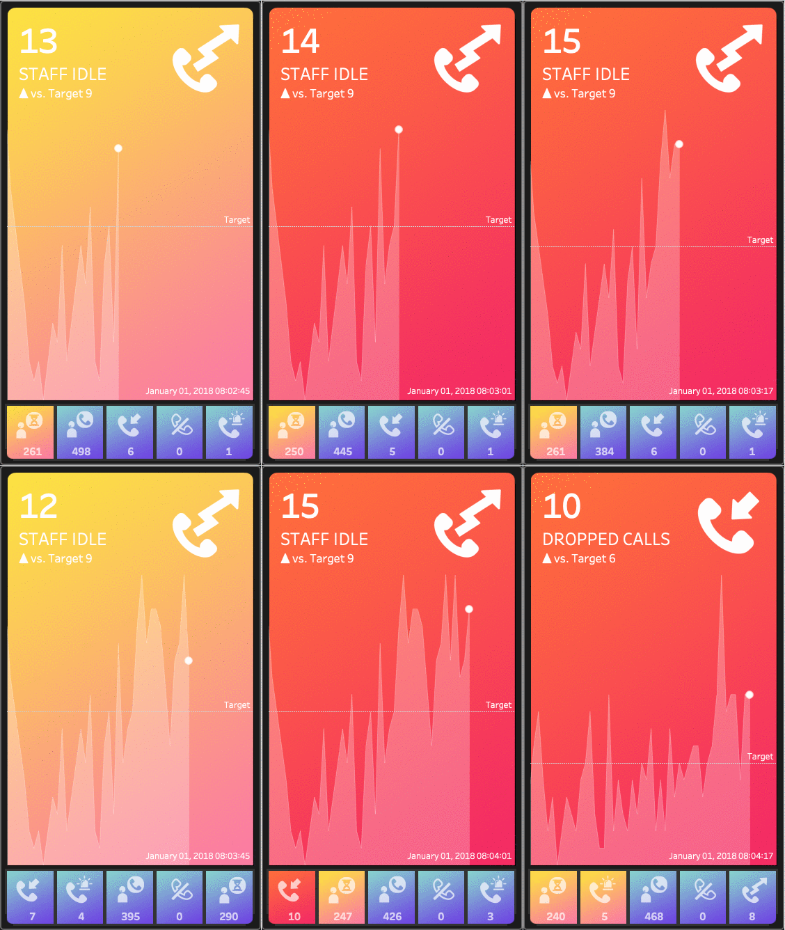
I seem to be in a mood about making the traditional KPI dashboard a bit more modern as well as increase the value to the end user by aiding the understanding of what is critical. If you haven’t already checked out the post on lighting, please do. It focused on lighting effects to draw the users eye to what is critical based on the impact of a KPI’s deviation from a target. In this post, we play with a KPI’s position on a “mobile app” as another method to assist the user in focusing on what is important now!

Read More

Dashboard Drama - From Flat to Fabulous!

Dashboard Drama - From Flat to Fabulous!

If we consider ourselves storytellers of data, then we should always strive to make those stories more engaging. Taking a cue from movies, photography, and stage, lighting can draw attention to the most critical components of a story. Directing focus is often relegated to minor visual cues such as a dot at the end of a sparkline, or an up and down arrow colored by good vs bad.  Instead of being adornment that distracts from the story, this use of “white space”, focuses attention. We hope this lighting technique adds an enhanced user experience by conveying the drama of a KPI’s deviation from the target’s impact on your organization.

Read More

"Off the Grid" - building Lo-Fi dashboards to create use and value

"Off the Grid" - building  Lo-Fi dashboards to create use and value

I recently had the opportunity to help organize and present at the first Tableau “Kenya Day for Data”.  In addition to great talks from powerhouses organizations like the World Food Progamme, and PATH, I ran a hands-on workshop on “How to Build Dashboards of Use and Value”.  What was unusual about the workshop is that it took place entire using flip boards, stickies, and markers, instead of in Tableau.  Without a pixel being pushed by the participants, they were able to walk away ready to build effective and powerful data tools. 

Here is the nitty gritty so you can hold a similar workshop at your local TUG, or office.

Read More

Extensions for Tableau

Extensions for Tableau

As you probably already know if you have followed some of my content over the past couple of years, I am pretty excited about the release of the Extensions API for Tableau. This blog is an overdue follow up from #TC18, where Tamás Földi and I presented on Extensions, demoing a number of extensions covering both advanced visualization types and capabilities (like write back). This post provides some of my own perspectives on Extensions in Tableau as well as the content presented during TC18, along with some new stuff.

Read More

Small Multiple Flows in Tableau

Small Multiple Flows in Tableau

Small Multiple Flows live up to their name, combining small multiples and flow elements in a single viz. This allows us to combine a set of events, providing an intense data visualization about these events, while also connecting one event to the next via the flow element. This technique does need a viewer to invest some time into understanding the various pieces of the visual. There is a lot going on, thus it will definitely require effort and a little time on the viewer’s part (and why I put detailed legends on both visualizations).

Read More

Layering data for custom Tableau visualizations

Layering data for custom Tableau visualizations

This post outlines a method that has been shared before in the Tableau community. I was initially introduced to it by Noah Salvaterra’s Chord Diagram a while back. 

I am going to walk you through a layering technique, which allows use, and re-use of a single axis in Tableau. This can be done at different levels of granularity, different fields entirely or completely synchronized throughout, thus it can adapt pretty well to various use cases. Need to create a dual-axis in a single axis? This technique can enable this for us (as long as you need the same mark type that is). 

So What? With this technique you can build more detailed and very customized visualizations directly within Tableau (without the need for extensive data prep).

Read More

More options for your Tableau Sankey Diagram

More options for your Tableau Sankey Diagram

A quick look around Tableau Public can often lead you to a Sankey diagram at some point. I can only speak from my experience, but the majority of these visuals (including mine thus far) leverage the sigmoid function. This technique has been posted about and presented on (including by me) quite a few times across the Tableau community, I first found it on Jeff Shaffer’s Blog and this has of course morphed many times and ways, for example, some of the great work done by Olivier Catherin to build a Sankey leveraging polygons (also found on Jeff’s Blog).

Not so recently, Tableau came out with some improved dashboard spacing capabilities in version 10.4. I had been awaiting this feature for a while and could not wait to update some of my Tableau Public work in order to take advantage of it (granted it took me a while to do so). Now we can get rid of those annoying spaces which have been forced into our (tiled) visuals to date.

Read More

Talk to your Tableau Dashboard

Talk to your Tableau Dashboard

Shouldn't an author be able to explain their Tableau Dashboard to every person who views it? Of course they should! This capability should be available to authors and accessible to their end users, regardless of the end user's abilities. We should also make Tableau's awesome interactive capabilities as accessible as we can as web users have vastly diverse abilities.

We noodled around some ideas of how we could enable the Tabitha project for those who did not want to write any code. This blog is the (hopefully) first step toward that effort…

Read More

Easy as Pie React + D3 Chord Diagrams in Tableau

Easy as Pie React + D3 Chord Diagrams in Tableau

… We are going to be integrating with and leveraging Nivo, which is self described by Raphaël Benitte (it's creator) as “supercharged React components to easily build dataviz apps, it's built on top of d3.” Nivo is one of many react component libraries that work on top of D3, each are different and bring their own features and focus to their projects. Here are a few more worth checking out (in no particular order):

I am going to assume you know how to leverage create-react-app and npm install to get up and running locally and import all the component libraries you will need. If you have not gone through this install process yet Chris’ blog walks you through some key steps you will need to complete, and Google is of course your best friend here. Here are the commands to run:

  • Create-react-app nivo_int

  • Cd nivo_int

  • Npm install tableau-api

  • Npm install nivo

That is it, if you run npm start at this point, your project will be bundled and rendered locally on your machine... Magic!

Read More

Visualizing MLB pitch location data with Alteryx + Tableau

Visualizing MLB pitch location data with Alteryx + Tableau

This project started with some really interesting reading on the work done by brooks baseball (Dan Brooks and several others) and fastballs (by Mike Fast) sites. There are references to these sites throughout this post. 

Data gathering & preparation work

I used the Perl script from the fastballs - build a pitch db page to download the data from this MLBAM site. Then I leveraged Alteryx to parse the 2.47 million XML files (no, that is not a typo) over the 8 years I pulled data for. Here is a summary of files and their combined size by year.

Read More

Where's DataBlick at #data17?

Where's DataBlick at #data17?

We're saddened and outraged by the tragedy in Las Vegas and offer our sympathies to those affected. And we are determined to help make the Tableau Conference a place of connection, community, and support for the attendees and those who were affected. Please check the #data17donates hashtag for how you can help out yourself, the Tableau community is already responding!

We've got a smaller crew than usual at #data17—it might be hard to believe, but babies and little ones can be even more fun than the Tableau Conference. No matter what, though, we're going to rock some new tee shirts, here's a sneak preview:

Read More