Data Inspires Us


War Games II
Featured in The Atlantic's City Lab website as well as in a NY Times documentary for RetroReport, this map was built by DataBlick talent Anya A’Hearn, Allan Walker, and Chris DeMartini. It uses open-source data on nuclear arsenals and digital artistry matching the world map from the 1983 cult-classic film, Wargames. This Dashboard illustrates beautifully with horrific simplicity what could happen in the event of a nuclear war. A Think Data Thursday highlights how it was done (start at minute 50ish).

Home Depot Customer Analysis
Here's what Home Depot says about DataBlick:
"Noah and Anya spent a great deal of time on the data-prep, and challenged us on what insights we actually needed. They delivered a set of dashboards that looked amazing, and were much more insightful than we could have ever imagined.
What stood out the most working with DataBlick was their passion for data and dedication to always find a solution. They went over and above to solve a complex data problem for us because it was fun for them!"

New York City Taxi
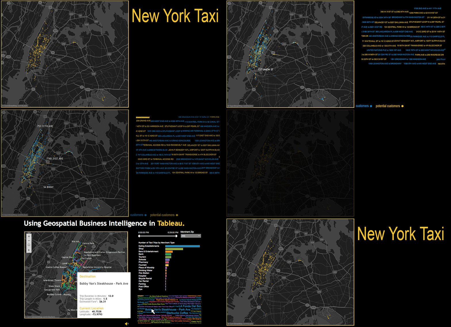
Data from the New York City Taxi and Limousine Company is animated in Tableau. The concept would be made relevant to a merchant or transaction processor; the taxi data could be tied to the consumer via a payment, or other loyalty program data capture. Current customers could be compared to potential customers to understand differences in demographics and travel patterns. One could see all the times a taxi passed by or stopped at a specific merchant. This information could be used to incentivize purchases. This geospatial and consumer information can be interacted with and analyzed further inside of Tableau to gain valuable consumer insights.

Tableau Tesla
We can build almost anything in Tableau, even a Tesla! Get out your Chroma Scale glasses and enjoy it in 3D even. Imagine what we can do with your data!


