Building a Visualization of Transit System Data Using GTFS
/
Yes, yet another Allan Walker and Anya post about mapping things :-). This one however is a precursor to some very fun JS API how to's, including how to animate the viz, coming soon featuring Chris DeMartini . Stay tuned!
Q: Um, what is GTFS?
A: The General Transit Feed Specification (GTFS) defines a common format for public transportation schedules and associated geographic information. GTFS "feeds" allow public transit agencies to publish their transit data and developers to write applications that consume that data in an interoperable way.
https://developers.google.com/transit/gtfs/
Q: And I care because?
A: Use Tableau to build a map of transit data and incorporate it in a BI dashboard for analysis. What is the average route duration, fare, number of stops? How many are wheelchair accessible? Don’t care about BART? Check out the list of all the agencies that use this format at http://www.gtfs-data-exchange.com/agencies .
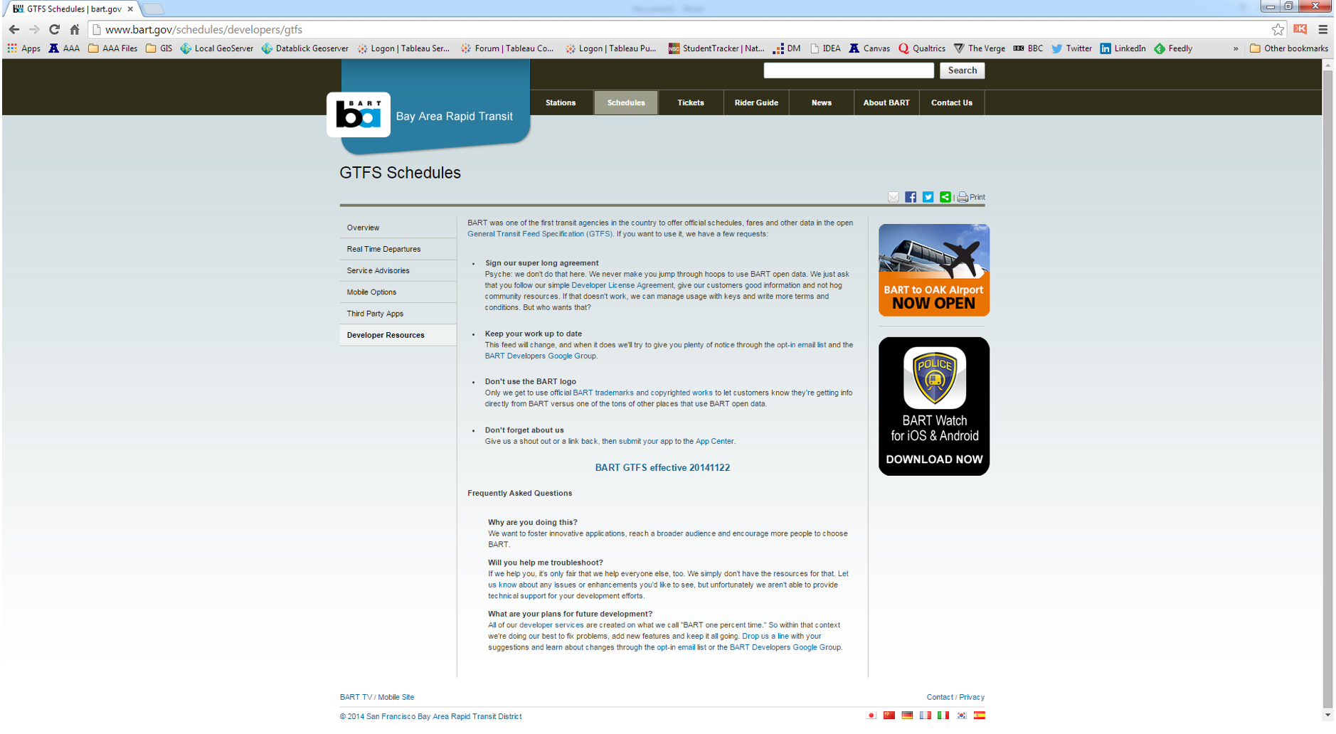
Step 1: For the sake of this demo, visit the http://www.bart.gov/schedules/developers
Step 2: Download the GTFS zip file at http://www.bart.gov/schedules/developers/gtfs
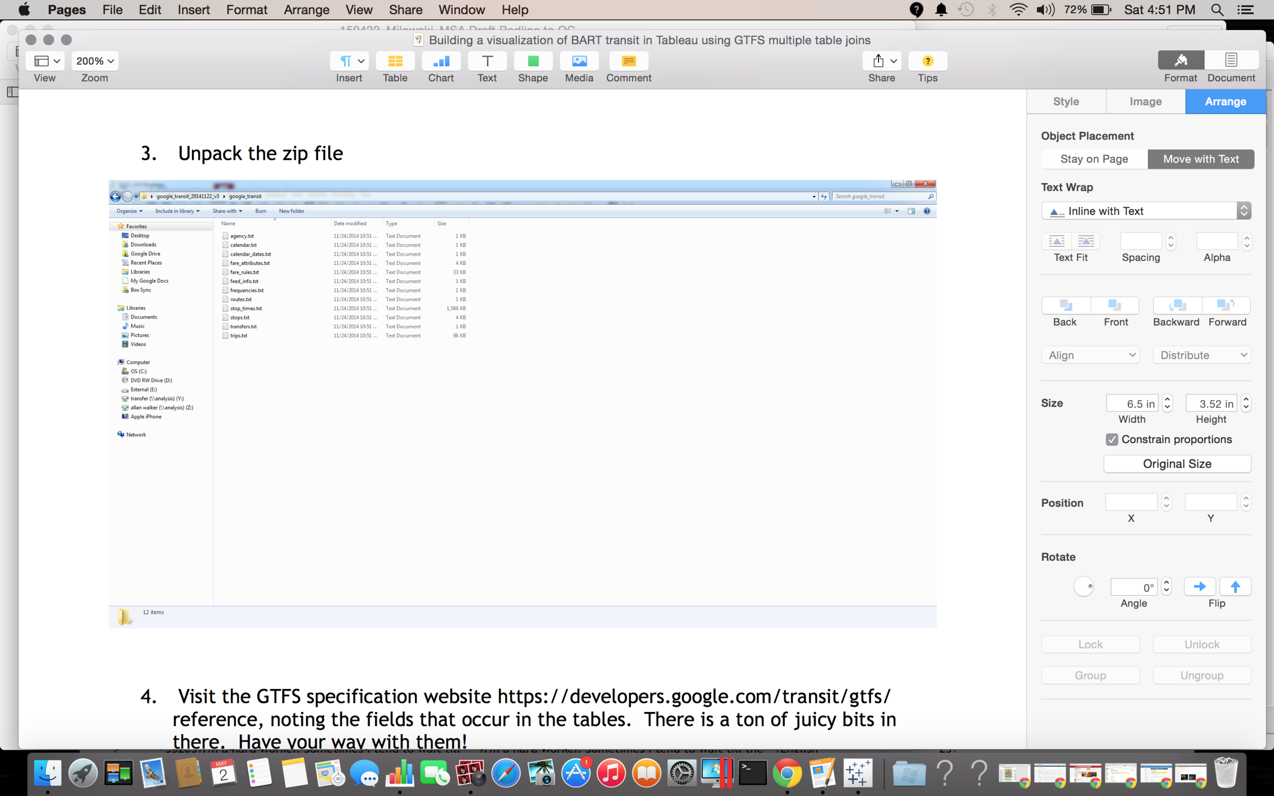
Unpack the zip file
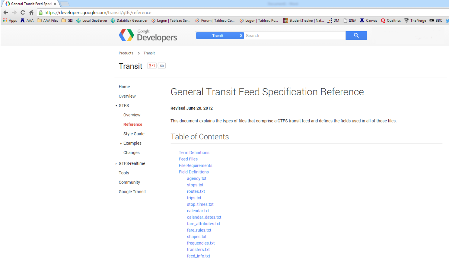
Visit the GTFS specification website https://developers.google.com/transit/gtfs/reference, noting the fields that occur in the tables. There is a ton of juicy bits in there. Have your way with them!
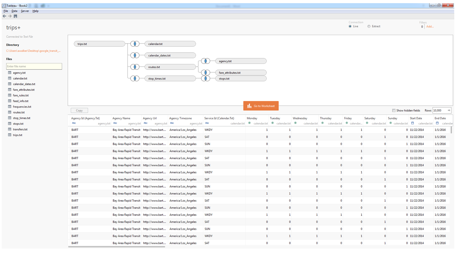
Fire up Tableau and begin joining the tables.
Start with the trips.txt
The joins are inner and magically delicious and just happened when you click a table to add it, but just in case here they are:
- trips.txt to calendar.txt on service_id
- trips.txt to calendar_dates.txt on service_id
- trips.txt to routes.txt on route_id
- routes.txt to agency.txt on agency_id
- routes.txt to fare_attributes.txt on agency_id
- trips.txt to stop_times.txt on trip_id
- stop_times.txt to stops.txt on stop_id
- Extract the data (Optional – filter for a specific day to speed things up a bit while you play with the data)
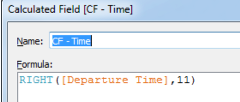
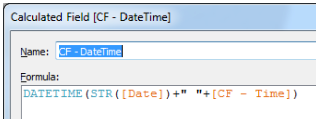
Let’s create our first Calculated Field (CF), based on [Departure Time]: “CF-Time”. First, change [Departure Time] to a string, and add the calculation:
RIGHT([Departure Time],11)
Next, let’s create another Calculated Field to concatenate [Date] and our [CF -Time] field: “CF-DateTime”.
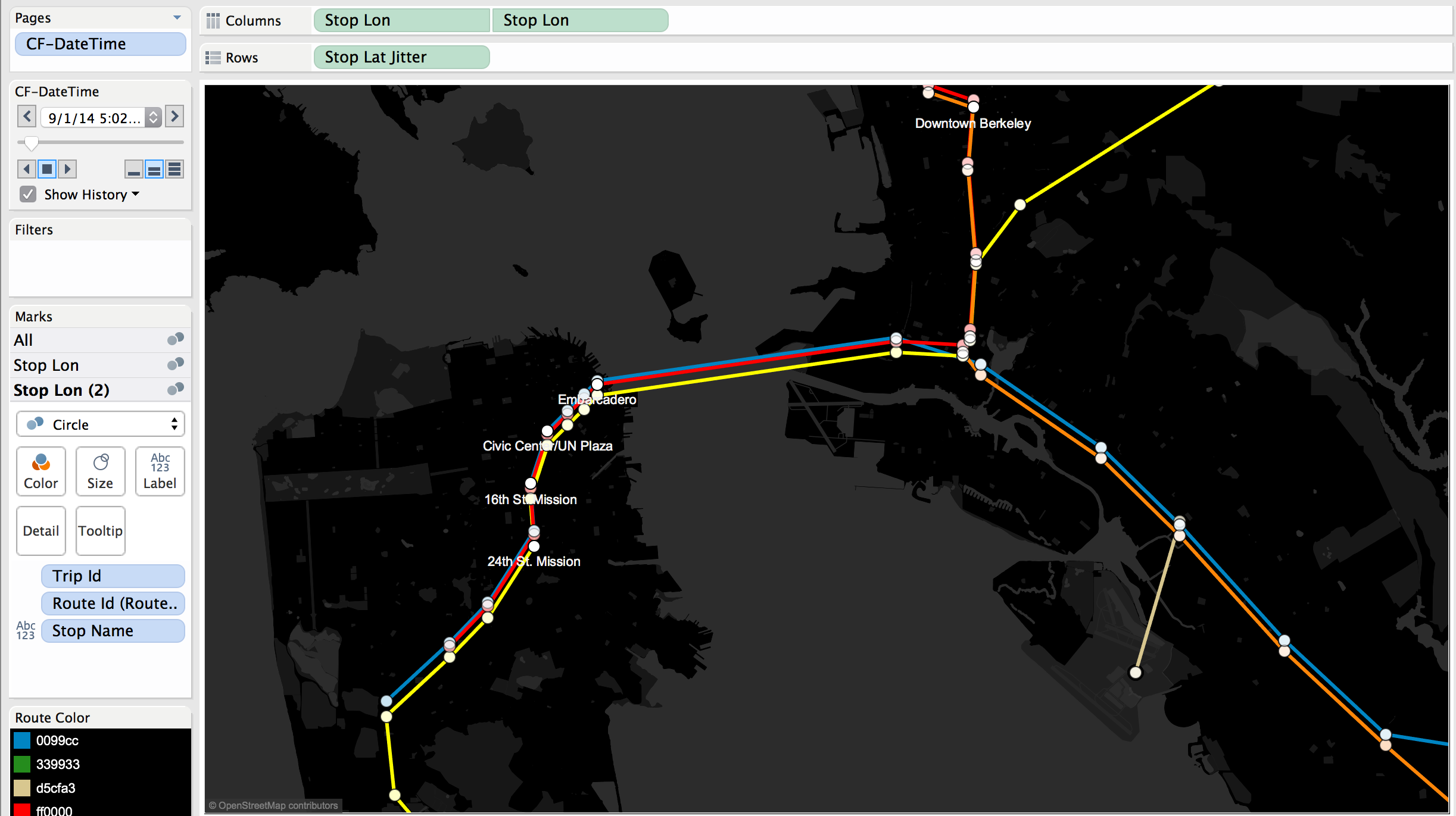
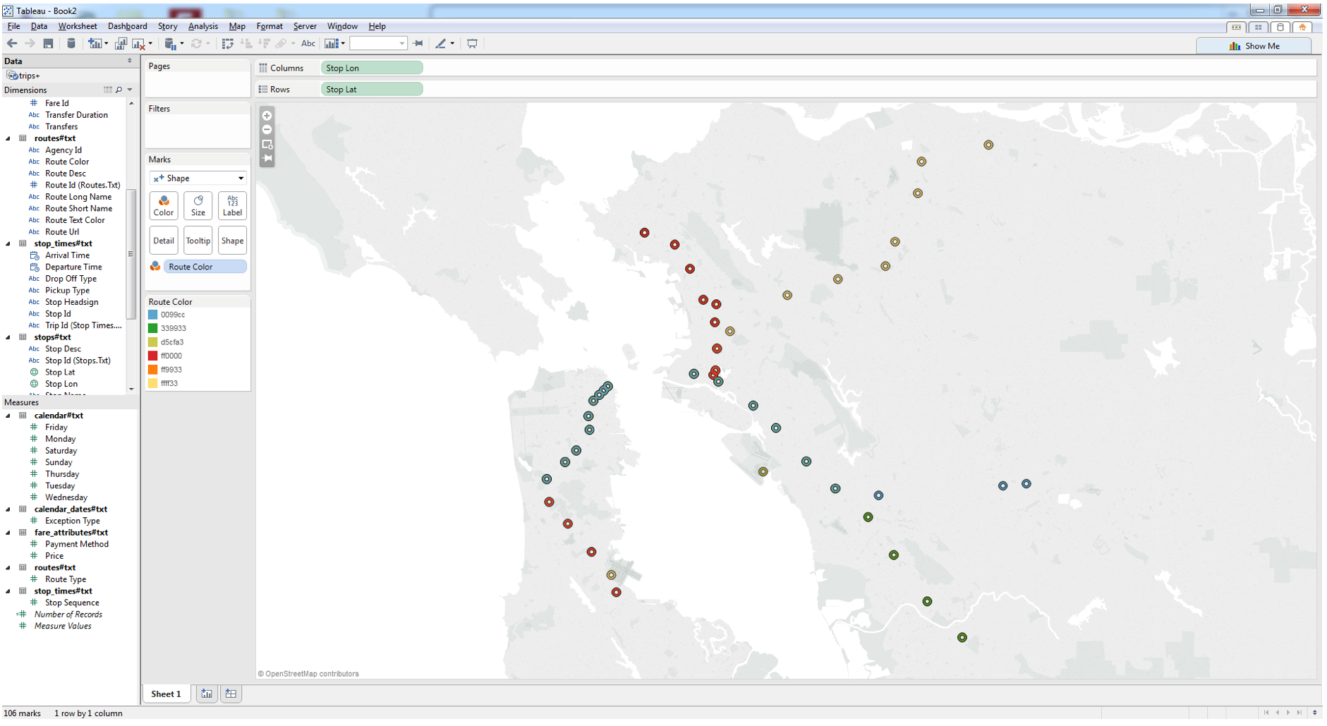
Make sure that your [Stop Lat] and [Stop Lon] are dimensions. Drag [Stop Lon] onto the columns and [Stop Lat] onto the rows. You can now see all the stops (BART Stations) on the BART route.
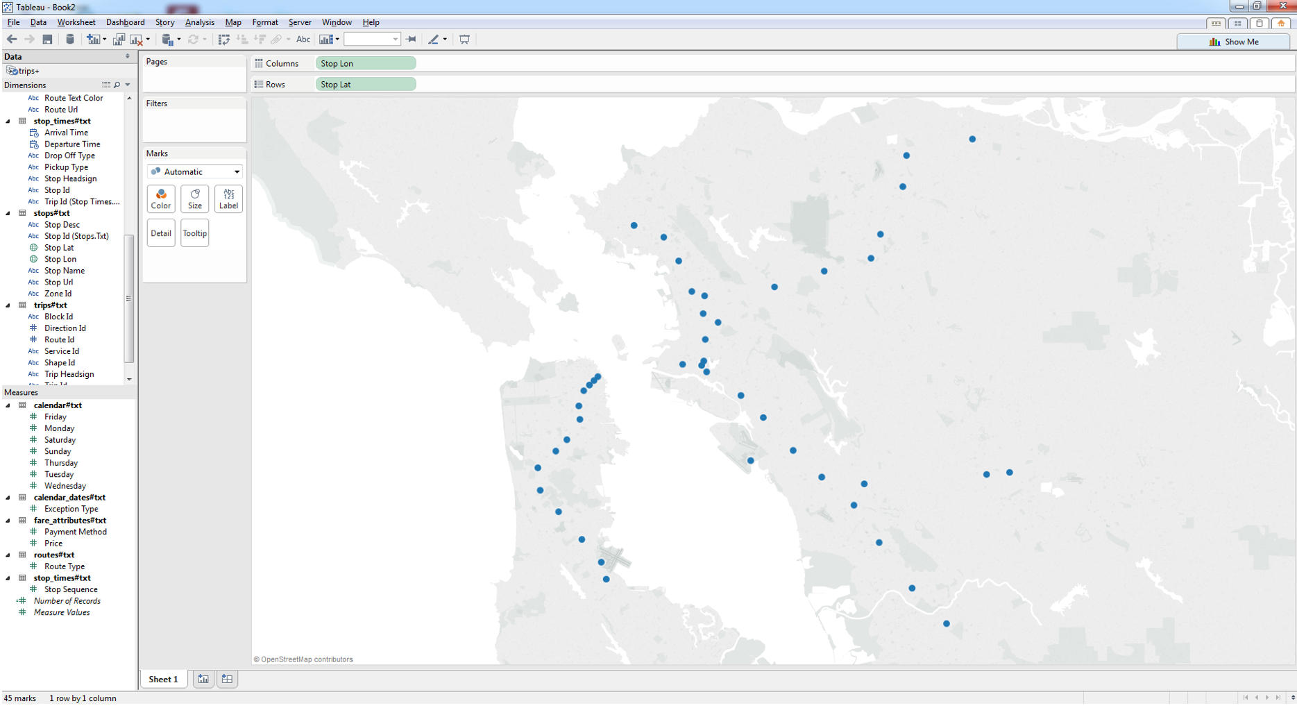
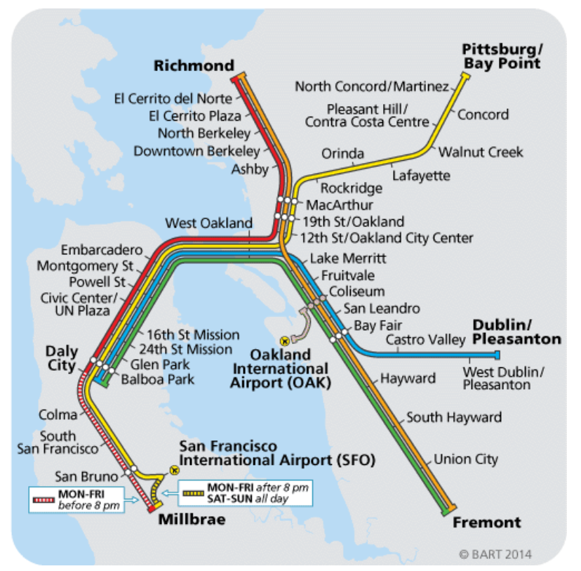
Drag [Route Color] onto color – these are hex values that correspond to the color of the BART system map. (Note that some stops are serviced by more than one route, and only the top color in the sort order will appear.
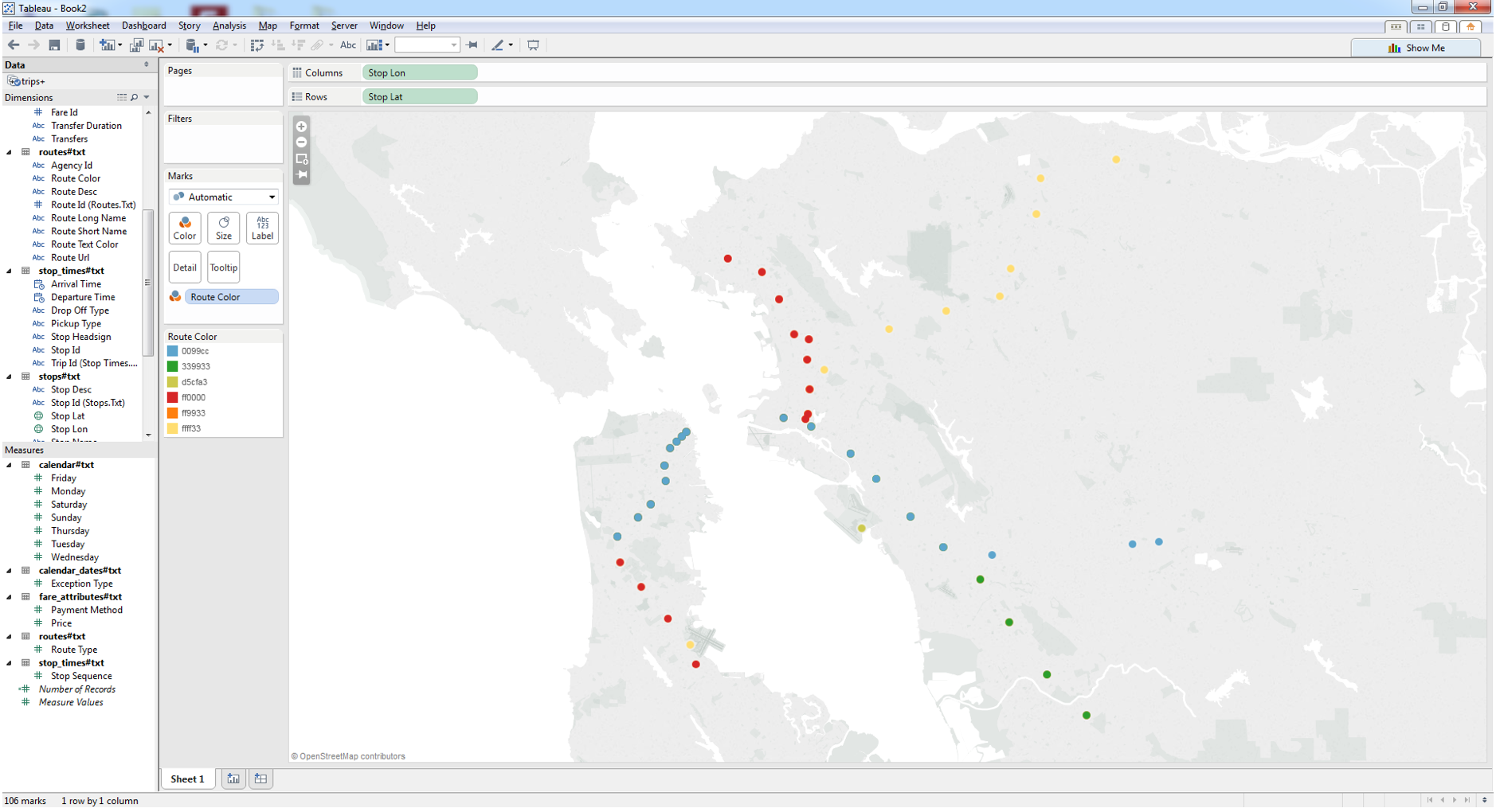
You could go pie chart on the stops, but you would be harassed to no end by Andy Kriebel. If you need to convert Hex colors to RGB, use a website such as http://hex.colorrrs.com/, otherwise change the colors in Tableau to match the Hex code. They will now match the colors on the real BART Map.
Make sure the mark shape is a filled circle and add a black halo using the color card. This is just for formatting but it will make the stops look more like the ones on the original BART map when you are done.
Then Move the [CF – DateTime] to the Pages Shelf. Using the arrow to the right of it, choose Exact Date. This will speed things up, but also let you see what a day in the life of the BART looks like.
Check the Show History box, selecting “All” history and “Both” marks and trails.
Drag the Pages slider all the way to the right or just hit play and wait (or go get a beer while it plays). It's a total mess!
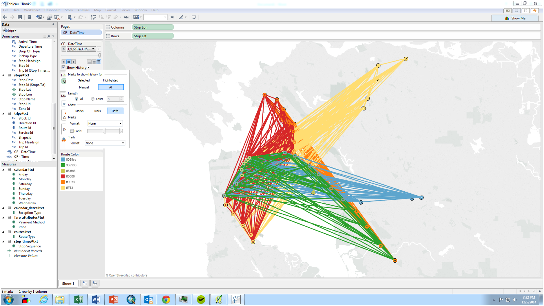
Drag [Trip ID] onto Level of Detail
Click “play” on the slider to see trains depart each station on the BART Routes!
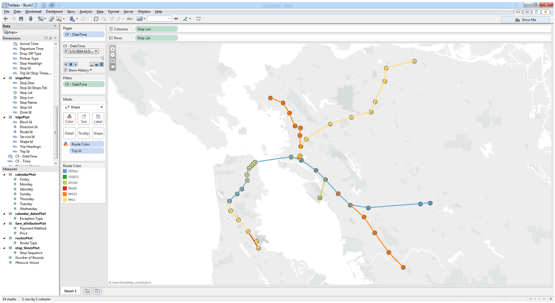
Let’s add some labels, and tidy up the stations. Add [Stop Lon] again to the Columns Shelf and create a dual-axis.
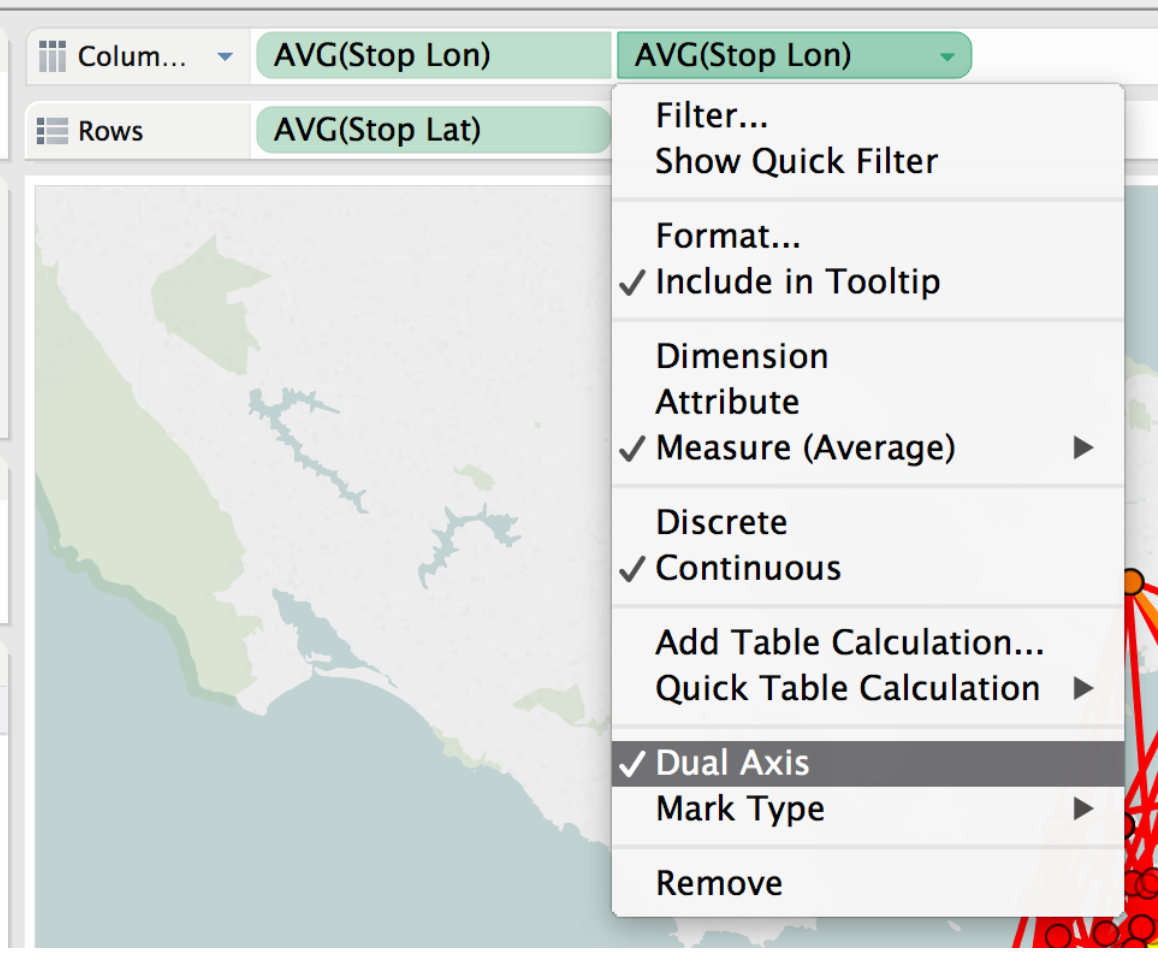
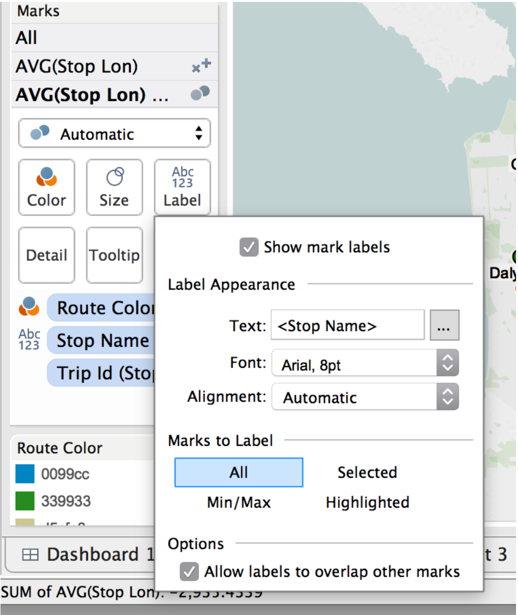
Change the mark type to circle for the second mark type. Remove the Color pill for [Route] and change the color of the circles to white if you want to look like the example. Add [Stop Name] to Label, allowing labels to overlap other marks
Make the Map Black, because Allan likes to get all Johnny Cash and makes everything a black. But really, just go to your Map menu, and select Map Options and play to your hearts content.
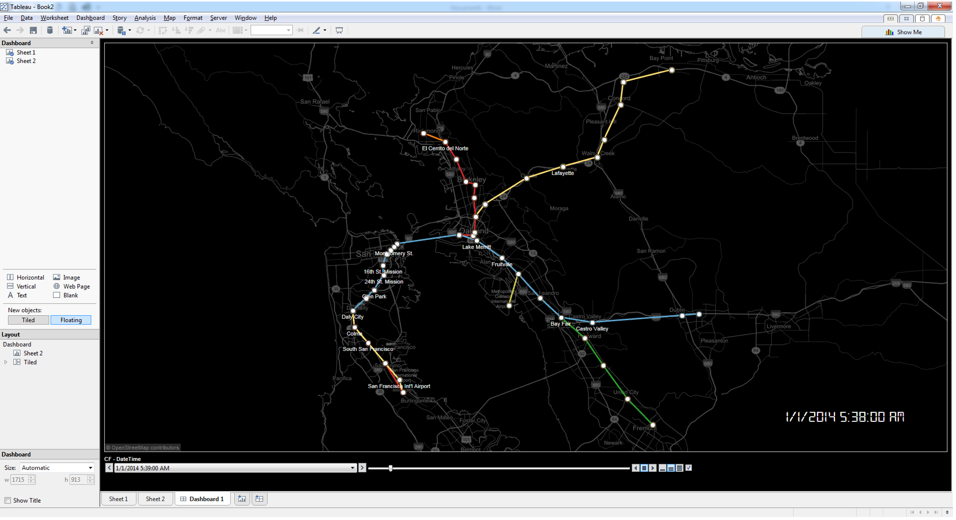
Now it’s time to create a dashboard with our map. Add the map you just created to the dashboard and move the pages controls to the bottom.
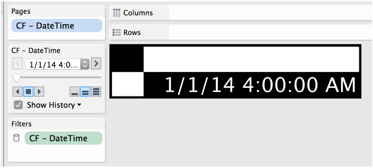
Let’s create a “timer” in a second worksheet. This will display the latest time being show in the Pages Shelf. In the new worksheet, Drag [CF-DateTime] to the Pages area and change to show Exact Date just like we did on the other worksheet. In “Show History”, only show the last 1 mark, also check the “Fade” box.
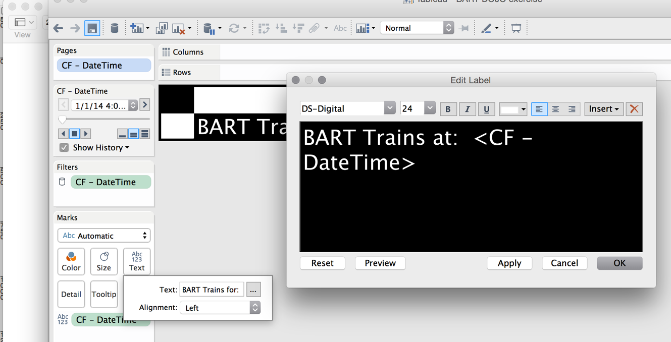
Add [CF-DateTime] to the Text card, and change it to Exact Date.
We will use this sheet as the header of the dashboard. Click on the Text Card and add the text “BART Trains at: “ before the field [CF-Datetime] Make the text big, and bold and in the color of your choice.
Add Sheet 2 to your dashboard at the top and hide the title.
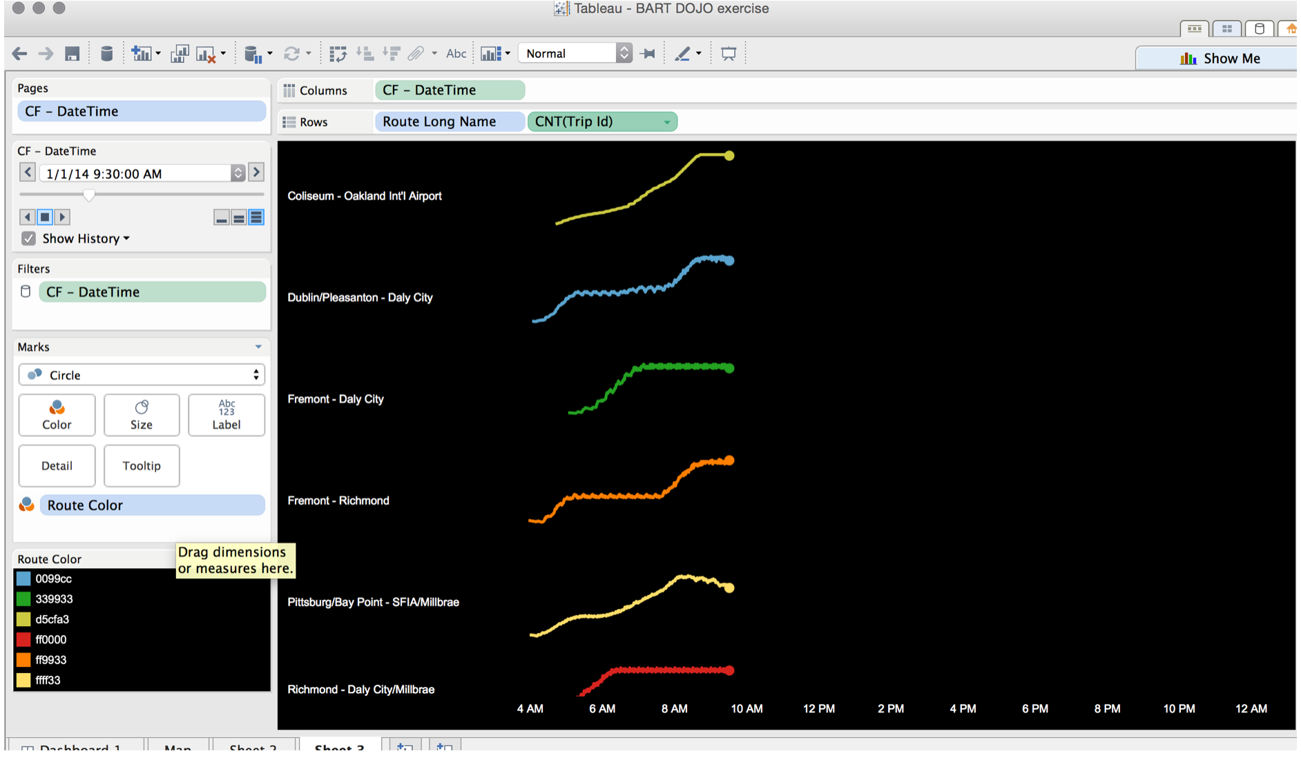
Let’s build some charts to complement the map. Sheet 3 is built using the set-up of circle mark type, history as trails, and a Count of the TripID by Route Long Name in the Rows:
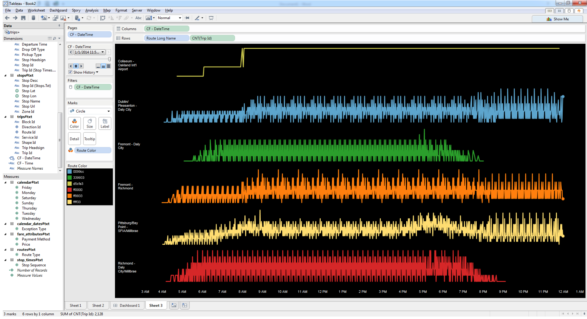
The view above shows for each minute or two that the pages go through how many BART trains actually have a record. As the trains only have a record when they depart a station and it may take more than a minute or two to reach the next station, you may choose to create moving average of the count of the [Trip ID] to smooth out the lines a bit.
Add any new views to the dashboard, but remember for the animation on the Pages slider to work, they all need to have the [CF-DateTime] in the Pages shelf, and all need to be set to “Exact Time”. Rearrange, and bend to your will. Go get another beer and show a friend how much you rock now that you can animate transit systems in Tableau, and mix BI, Data Viz and GIS together.

Optional Note:
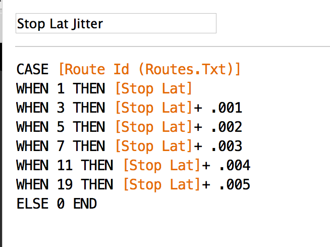
Perhaps the fact that the lines overlap bothers you, as only the top line shows. If so, just add a bit of "jitter" to your lines to space them a bit apart.