Time to Get Hopping with Jump Plot by Chris DeMartini and Tom VanBuskirk
/
In preparation for the upcoming Think Data Thursday, "I didn't know that was Tablossible", this post introduces a novel graph type referred to as the “Jump Plot”. Jump Plot is the brainchild of Tom VanBuskirk and was first implemented by Chris DeMartini using Tableau. This post is a combined effort from Tom and Chris. There are pieces of this post describing the benefits that Jump Plot provides, however additional details regarding the graph type and all it can offer can be found at jumpplot.com. In short, the Jump Plot provides a new way to visualize event data, with a focus on sequence distributions and bottlenecks. Here is a subset of use cases for Jump Plot:
- Any business workflow process (e.g., procurement, manufacturing and supply chain management, etc.)
- Software performance and bottleneck analysis (e.g. cross-tier, SOA, microservice, or other distributed software event sequences)
- Airplane turnaround (e.g., land, deplane, prep, re-plane, takeoff)
- Ground transportation (e.g., your daily drive to work or public transportation performance to schedule)
- Sports (e.g., finding slumps of MLB hitters and/or pitchers, “pace of game” rules effectiveness analysis)
- And many, many more!
Tom and Chris built a high level conceptual design of the Jump Plot using Tableau’s story feature (embedded below). Go ahead and click through to get a “how to” on Jump Plot:
Now, you have a few of the numerous use cases and a brief walkthrough of the graph type, should we get to how it was built in Tableau already?
The pieces required for the Jump Plot puzzle have already been laid out for us by Chris in his Hive Plot post earlier this year. In terms of underlying data structure, use of Bezier curves, placement of nodes, data densification and window table calculations we are really just going to make tweaks to that original work within Tableau to implement Jump Plot.
The Data – The only change to the data structure between the aforementioned Hive Plot post and Jump Plot is the fact that we are dealing with sequences of events when using Jump Plot. As a result we know that the start and end checkpoint (aka node) of each sequence will only have hops (aka relationships) in one direction, all other checkpoints should have hops flowing in and out of them. As a result, we see a similar data structure, but only one line for the first and last checkpoints in the series (lines 2 and 11 below). If you still need more on the data, feel free to further investigate the data structure within the Tableau workbook provided at the end of this post (there are several examples).

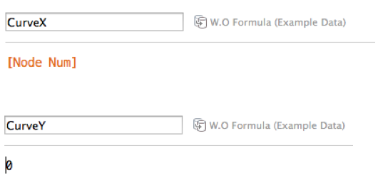
The Checkpoint – Setting up checkpoints is rather simple in Jump Plot (a good thing!). We will place all checkpoints directly on the x-axis and then either increment their x coordinate value by either; (a) the number of the checkpoint in the sequenced workflow or (b) an associated metric (often average time) between the sequenced checkpoints. In the Tableau example provided, this is executed using the two calculated fields shown below (implementing method a).
Now if we go ahead and plot those values as circles we will see something along the lines of this…

The Hop – Here is the more difficult of the two steps. However, there is a lot of help out there now when it comes to Tableau and creating curved lines in your vizzes. Jump Plot leverages the Bezier curve, allowing for hop height to be adjusted by a measure of time that occurred between checkpoints. So really our main focus going forward for Hops is going to be the “control point” of the Bezier curve. Following the steps for building a Bezier curve laid out in the Hive Plot post, we will use data densification and windowed table calculations to drive the below formula, the big question mark left to solve is the “DynamicP1X” and “DynamicP1Y” fields:

DynamicP1X will place the x coordinate of the Bezier curve’s control point. As a result this value will make the curve look slanted to the right or the left depending on its value. DynamicP1Y will place the y coordinate of the Bezier curve’s control point. As a result this value will make the curve look taller or shorter depending on its value. The visualization below is parameterized with control point coordinates x and y to allow you to play around with the control point placement and see the impact on the Bezier curve.
Now that we know how the control point affects the Bezier curve, we can define our calculations for these controls points based on our data. For starters, we will want the x coordinate to be halfway in between checkpoints, thus we calculate the midpoint as start + ((end – start) / 2), Tableau version show below. (Note: the window calculation is required as well when using data densification).

Our y coordinate is purely based off of our time or quantity/volume metric, in this example the calculated value of “TimeElapsed”, Tableau version shown below, same note above applies here re data densification.

So we have our checkpoints, curve equations and control points at this time, moving forward to graphing it will show us something along the lines (I mean curves!) of this…
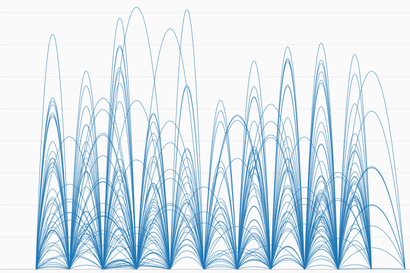
From here, we just need to add our checkpoints back in and we see the completed Jump Plot before us!
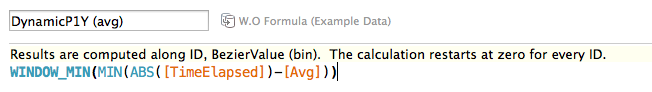
Threshold Based Jump Plot – In order to execute the Threshold Based Jump Plot we just need to make one simple tweak to the above walkthrough. When defining the hop height, we are going to compare this to a measure, key performance indicator, service level agreement, etc. This is done by changing the y coordinate values that drive the y control point. Here we have updated the mock up shown above with an assumed threshold of 1 for each hop. The below shows the formula for a new field “DynamicP1Y (avg)”; this field is used to implement the Threshold Based variation in our example Jump Plot.
As a result of the above comparison, all hops with a measure value of less than 1 are shown below the x-axis and those of more than 1 are shown above the x-axis in our viz below.
There are a number of additional uses and variations of Jump Plot on jumpplot.com so definitely check there if you have additional questions/interest in Jump Plot. You can contact both Tom and Chris through that site or find Chris and Tom on twitter. At this point we will leave you with a workbook that has several examples of Jump Plot vizzes for you to noodle over, just use the tabs at the top to navigate through the various examples.
