Design Your Data Viz Like a Product Designer
/
After presenting on “Using Design and Emotion to create a Viz with Impact” at TCC13, one of the most common feedback comments was, “I never realized how many iterations and how much time you put into your viz’s.” Having studied Industrial Design, it seemed only natural to follow a “Product Design” process when creating data visualizations. Isn’t a data viz a product that you hope people will “consume” because they find it of use and of value? People are bombarded all day long with emails, tweets, Facebook posts, etc. Why should they spend the time to look at your data visualization? Just like a product, your viz should be designed with a specific goal and context in mind, and should capture the consumer’s attention immediately and provide a value to them. Product designers go through a process to develop new products which generally consists of analysis, concept development and product creation steps (followed by feedback and further development and creation). When working on a data viz project, similar steps can be followed.
- Analysis – what are the product goals and context
- Image study – research other products/images for inspiration
- Assess constraints and resources
- Rapid prototyping / visualization mockups
- Development of a working prototype
- User feedback
- Refinements / redevelopment based on feedback
- Final product version
- Launch
Using a visualization created for the 4th of July on Fireworks as an example, I will walk through product design process used to create it.
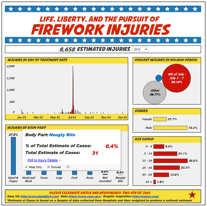
1. Analysis – Goals and Context As a huge fan of fireworks (and naughty backyard pyromaniac), I wondered if there was data about fireworks, and happened across the Consumer Product Safety Commission site. I noticed that there was a huge spike in the number of estimated injuries associated with the 4th of July and wanted to create a humorous, but informative data viz that would act as a friendly reminder to be “safe and sane” with fireworks (goal) over the holiday (context).
2. Image study – research other products/images for inspiration I really liked the concept of using humor to create a product safety warning like the cartoon, “Dumb Ways to Die” . As the data involved the 4th of July holiday, I also looked to inspiration from old “Schoolhouse Rock” videos about the founding of America. Mostly, I knew the visualization would have to be as explosive as fireworks!
3. Assess constraints and resources When designing a product - your ability to create a product is limited by many constraints such as:
- Who is the consumer? What is their knowledge on the topic? In what format will they consume the data in (i.e. print, blog, variable screen resolutions, etc.)? Is there a timeline or deadline for consumption?
- Is the data needed for the project available, reliable, and in a format that is usable? I always say that data has a wicked sense of humor!
- What are your skills as a data viz designer? What tools are available and what is your level of skill at using them?
In the case of the Fireworks viz, my consumer could be anyone who gets a web link to the data viz via Tableau Public. The project needed to be done at least a couple days before the 4th of July holiday so that the topic would be current. I knew I wanted to use cartoon characters, and although I have experience with Photoshop and Illustrator, my skillset was not perfect for this, so I enlisted the help of a friend Ray Yuen for illustrations. The data was easily available, but needed a bit of formatting, joining to reference tables, and research as to how the estimated injury figures were calculated and how they could be used in comparisons and calculations.
4. Rapid prototyping / visualization mockups This is the real brainstorming part of the process. The first step was to play with the data and generate many different views to try and see what the story was that the data was telling (rapid viz). Just try out every combination of data and chart styles that is possibly of value and see what pops out. It was obvious that the injury timeline was the most important view to show as it dramatically highlighted the disproportionate amount of firework injuries that occurred on the 4th of July. I also wanted to compare that holiday to the total injuries for the rest of the year, as well as to the one other holiday that I associate with fireworks, New Years. Other areas of interested were who was getting injured, and how they were getting injured. The basic viz with limited formatting is below. All the charts act as filters for all the other charts in the view making the analysis really simple and easy to use with limited instructions or previous knowledge of interacting with this data.

Then the real fun began. Initially, I wanted to go with a concept of cartoon British and American soldiers getting blown up by fireworks.
 There were a couple of different ideas for how best to show the injury location, either individual characters with specific body parts injured, or one character with an overlay of injuries all over their body sized proportionally to the number of estimated injuries for that year and demographic.

Ray and I had been collaborating over the phone and email, so we decided to meet in person to brainstorm together. We happened to meet at Yeti Zen, a collaborative work space for game designers. The office space became the new inspiration to go for a comic book look and feel. I remembered the old Batman and Robin show where the cartoon “Pow!” “Bang!”, etc. would flash on the screen when they had a fight.
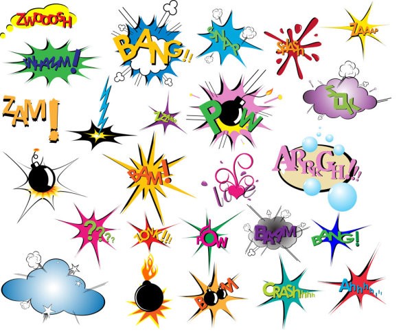
Ray was kind enough to indulge my change of plan and came up with some really fantastic comedic gore.
 In addition to the cartoon injuries, I wanted the rest of the look and feel of the visualization to be reminiscent of an old comic book as well. Using bold colors and cartoon “frames” to layout the data views, the viz was really starting to come together as a data product.

5. Development of a working prototype Now it was time to add in the wonderful illustrations that showed off the bloody body parts and maimed characters. I played with many different ways to incorporate the injury data. I wanted to do so in a way that added value to the data viz, but didn’t detract from the already powerful story that the data was telling on its own.
 6. User Feedback
This is the hardest part of the process. After working so long and so hard on the project, it’s time to swallow your ego and pride and let some friends rip it to shreds. Buy these folks some beer or bake them cookies, because it is hard to find someone willing to be brutally honest with you.
6. User Feedback
This is the hardest part of the process. After working so long and so hard on the project, it’s time to swallow your ego and pride and let some friends rip it to shreds. Buy these folks some beer or bake them cookies, because it is hard to find someone willing to be brutally honest with you.
7. Refinements / redevelopment based on feedback The main feedback that I got was that the cartoons were making the viz busy, or obstructed the ability to view the data accurately. They were taking center stage as opposed to letting the data tell the story.
Another bit of feedback was that people wanted to read about the actual injuries. Incredibly enough, people would tell their doctors about all kinds of stupid things that they did with fireworks, particularly involving bottle rockets and bottoms. This was a great piece of feedback as it led to the annotation layer mentioning “naughty bits” which added to the humor and accessibility of the viz product. I also added the ability to drill through to the detailed medical report data so the consumer could explore this information further.

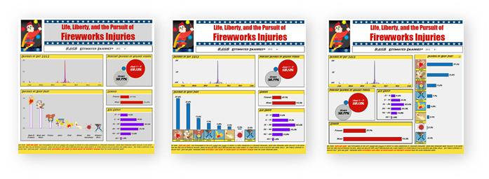
8. Final product version In the end however it seemed that the cartoons, overpowered the data and didn’t add value to the story. After all that, they got removed! The final step was to add the title and header’s with custom fonts. As Tableau does not support embedded fonts (yet – hint, hint….), I had to create these in Photoshop and add them as floating images in Tableau. This is where the pixel alignment feature comes in very handy. It not only helped to align the headers, but also ensure that the grid formatting and “white space” between the frames was lined up correctly.
9. Launch One of the great things about Tableau Public is how easily the data viz can be emailed, embedded in a website or blog, tweeted and posted to Facebook. As the viz was finished with only two days until the 4th of July, I also shamelessly emailed the Tableau Public team tableaupublic@tableausoftware.com asking to be posted as Viz of the Day, and they very kindly posted the viz the next day!
One of my favorite things about Tableau Public is that it allows you as a designer to create amazing things with data and then share it easily with the world.
