Comb the Hairball with BioFabric in Tableau by Chris DeMartini
/
Yet another amazing guest post by Chris DeMartini showing amazing options for visualizing for network graph data in Tableau. I am particularly fond of this one and already have users chopping at the bit to visualize their data this way. Thank you Chris!
Recently I posted about creating circular and hive plot network diagrams using Tableau and a question was posted around whether we could also execute the BioFabric network graph within Tableau. There is a lot of additional information about the BioFabric network graph at their website. The super-quick demo is a good intro to the graph if you have not seen it before.
The answer to the question posted is yes and this post is designed to walk you through the steps needed to build your own BioFabric graph within Tableau.
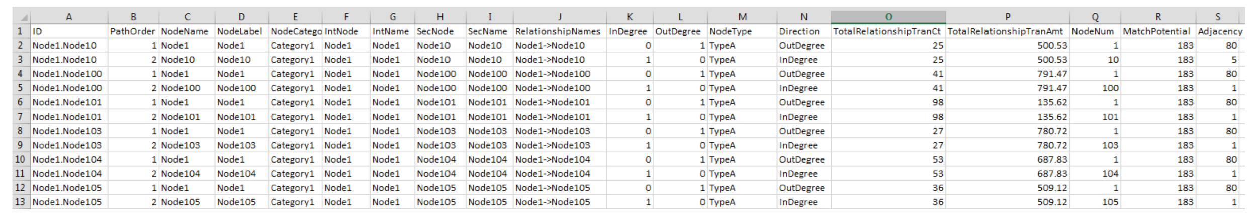
First things first the data. I used the same underlying data structure that supported the hive plot network post mentioned earlier. However if you want to save a click, here is a screen shot of what that data looks like. 
I also obtained network data generated from Les Miserables, and reformatted the data to match the above structure. Here are the main aspects of the underlying source data requirements: Each edge (relationship between nodes) should have 2 records representing the output node and input node of the edge. Nodes have been numbered based on their degree of adjacency, ordered from highest degree node to lowest degree node. For example node 1 has the most edges, node 2 the second most, etc. My ID field is a combination of the edge output and input nodes separated by a period (e.g. AM.GP is the ID for the edge between nodes AM and GP). This is the identifier for an edge. I also added relationship count which is the number of instances that this specific edge exists in the network.
The above captures the main concepts of the underlying source data, but do review the data within the viz if you want further details.
Onward we go to BioFabric! According to their site (see Significant Features section) I noted the following: Edges are represented as one-dimensional vertical line segments, one per column, terminating at the two rows associated with the endpoint nodes. Nodes are represented as one-dimensional horizontal line segments, one per row. Edges are drawn darker than nodes; this has the effect of emphasizing the links and making them appear to float in front of the nodes. Edges are unambiguously represented and never overlap. Note: There are several other meaningful points in this section of their site, however I am going to focus this post on the ones described above.
Where do we start? Let’s get going with getting edges to show up as vertical line segments.
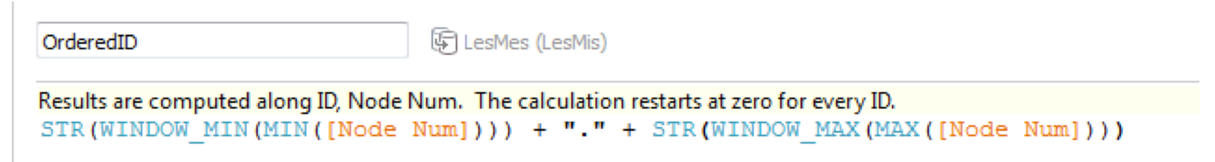
We need a calculated field which I named “OrderedID.” This field was created to address the placement of edge line segments on the X axis. The thought here is to ensure that edges are ordered and grouped based on the degree of their nodes. We want the edges ordered by node degree as follows: edge 1.2 should be before 1.3 which is before 1.10 which is before 2.3 which is before 5.2 and so on. I used the following table calculation. 

Which results in this value for the OrderedID field (regardless of edge direction this will place the higher degree node first and the lesser degree node second, assuming node number is ordered). You can play around with this equation (and node number) to modify the placement of your edge segments on your viz. 
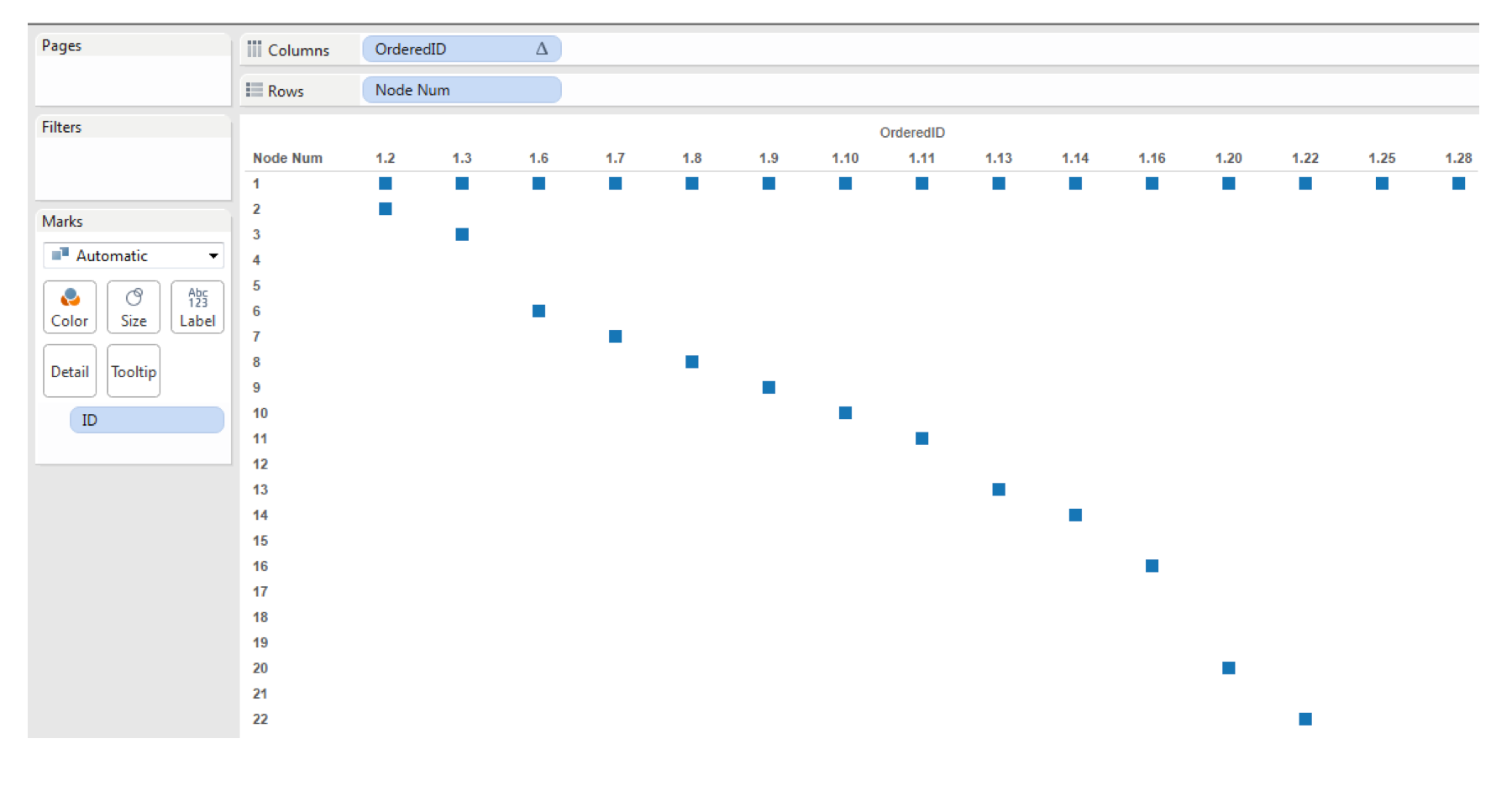
So now we need the Y axis for our vertical lines, this is simply going to be node number. So we drag OrderedID to Columns, Node Number (a dimension in my data) to Rows and make sure that ID is placed on the Detail shelf. 

Then we change mark type to line, change view to “Entire View”, change color to gray and 50% transparent and remove markers from lines and we have vertical edge lines! 

Next we need to get the horizontal node lines and color by node. I first did this on a separate sheet by making a copy of the above sheet. On that copy we then drag node number onto the color shelf and we now see the below. 
Sweet! We have one sheet with vertical edge line segments and one sheet with horizontal node line segments, now let’s just put them together right?
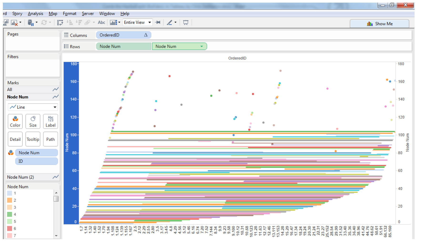
One issue you will run into at this point is that Node Number is a discrete dimension, we need to do a dual axis and in order to make that happen we need to convert Node Number to a continuous dimension, after making that change and executing and synchronizing the dual axis we see this… 
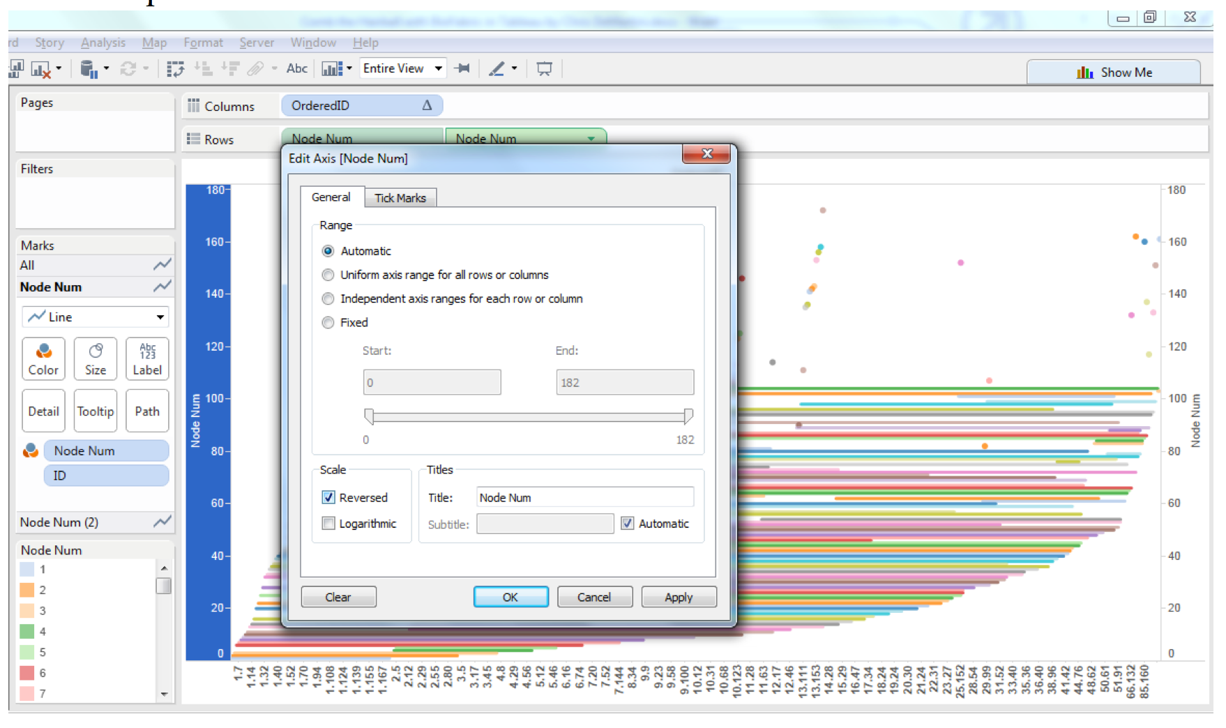
Looks OK, except it is upside down. To fix that we just edit the axis and click the reversed option box. 
Now we are right side up again and we need to make a few last changes to combine the two sheets into one view. Here are the steps I took… On the second Y Axis (vertical edges) Drag Node Number from Color to Path Adjust gray color darker or lighter as desired, I used 75% transparency Make sure line size is as small as possible Make sure the second Y axis is in front of the first Y axis Make sure line markers are off Adjust tooltip to you requirements (note: dimensions need to be brought in as attributes to keep from effecting the line paths and table calculations) On the first Y Axis (horizontal nodes) Make sure line size is as small as possible Make sure line markers are on for all points Adjust color transparency as desired, I used 60% Adjust tooltip to your requirements (same rules apply)

Once you have adjusted the Y axes as you want, you can then hide all of your headers from all of your axes, and now we have a BioFabric! 
At this point, you can play around with colors, ordering of nodes, grouping of nodes etc. to change the look and feel of the graph. There are some other rulesets which I did not focus on listed at biofabric.org and with some additional work we could probably incorporate those as well.
Hope you find the post and graph type useful, and thanks again for sharing your blog Anya!
Sources: Biofabric.org (graph type source and explanation) https://github.com/mmlc/lesmiserables-character-network (les miserables data)
