Building towards d3.js “plugins” for Tableau
/This post is a follow up to my Vizception post from a few months back. We are still building off the technique described in detail within that effort. Here we will look at two additional implementations leveraging the capabilities available within d3.js (thank you Mike Bostock!).
The first of the two implementations looks at leveraging d3.js mapping projections. Tamas Foldi and I presented this example during a recent Think Data Thursday. Here we will leverage the referenced d3.js code and adapt it for use with our Tableau integration method. This will allow us to build choropleth maps in Tableau with access to the d3 projection library which provides just a few more options in addition to your standard Web Mercator (the Tableau default).
Let’s take a look at the example, and then we can go through some details of how to make it happen. You can modify the view by changing the parameters provided.

click on the image above to view the git repo
Here are a few tweaks and modifications I made to the initial Vizception code base to make this work. First things first, we need to modify our Tableau event listener to work off of parameter change instead of mark selection. Here is that line of code, we are now calling the function “onParmChange” each time the user changes a Tableau parameter.
Next, within the function we are calling, we are going to do one of two things depending on which parameter the user has changed. This is executed with an if statement and by calling different functions based on the parameter name.
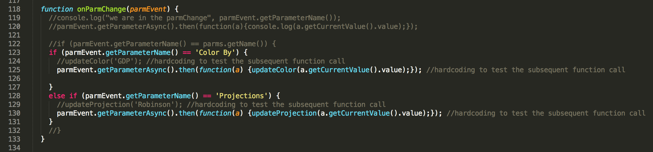
Each of those functions will either transition the opacity of the choropleth or the map projection based on the user selection (named accordingly).
We put this together along with mapping the getData() call to the d3.js visualization and we can leverage d3 map projections within our Tableau dashboards.
While I have only touched on a few snippets, the entire code for this example has been published to Github here.
Still with me? Let’s get into the second example, leveraging d3-brush to filter a dashboard. This is the simplest implementation I have shared thus far. As a result, I was able to spend a little more time on the “plugin” aspect of the deliverable. Assuming these files have been saved onto your Tableau Server, these are the two things that a Tableau dashboard developer will need to do to leverage this technique (e.g., no more hard-coded field names).
- Drag a webpage object on their view with the correct URL. (See the caveat below, but for now the size of this object should be ~975px width and 75px height.)
- Create two parameters
- “xAxisField” – The name of the Date field to display on the X-Axis (also used for date range filtering).
- “yAxisField” – The name of the measure to display on the Y-Axis.
- Caveat – This is still fixed in size, with more work it could be built completely responsive, etc. to make it adaptable in any size dashboard vs one that is fixed in size.
Let’s take a look at the result and then get into some of the details. You can modify the view by moving, shrinking or expanding the brush component (grey rectangle) of the d3 visualization.

click on the image above to interact directly with the brush example (a slightly modified version for public consumption)
Let’s look at the calls where we leverage the Tableau parameters to drive the d3.js visualization. Here we call getParametersAsync() and then store the resulting array into the variable “parms”. We loop through the array and look for our two specified parameters and also store their corresponding values into variables. We will later reference these variables for all arrays and manipulation associated with our getData() call at the bottom of the code snippet below.
Let’s also look at the modified “brushed” function from the d3.js code referenced above. We have changed this to leverage the Tableau JS API and apply the appropriate filter to the sheets in our dashboard upon being called. Here we leverage the applyRangeFilterAsync() call to apply the min/max date values of the brush to our dashboard.
While I have only touched on a few snippets, the entire code for this example has been published to Github here.
As you can see, we are inching closer and closer to this code being a stand alone plugin on Tableau Server. As I said in the Vizception post, I am really excited about all the possibilities this can open up and firmly believe that we are just scratching the surface with the above examples.
