Feeding the screen-time beast with shifting mobile metrics
/
Google “Tableau Mobile Dashboard” and the top images are still from the fabulous Kelly Martin. That is a post from 2015. Its about time for some new fabulous!

There are a lot of helpful hints on modifying desktop dashboards into mobile ones. They tend to focus on altering the layout to be tall and being mindful of finger-based interactions. I feel they forget one critical aspect - users don’t actually want to look at dashboards on a mobile device. Now with that blasphemous statement out of the way, let’s get on to what users on mobile do want, an analytics app that serves up relevant content that is engaging, useful, and quick to digest on the go.
I seem to be in a mood about making the traditional KPI dashboard a bit more modern as well as increase the value to the end user by aiding the understanding of what is critical. If you haven’t already checked out the post on lighting, please do. It focused on lighting effects to draw the users eye to what is critical based on the impact of a KPI’s deviation from a target. In this post, we play with a KPI’s position on a “mobile app” as another method to assist the user in focusing on what is important now!
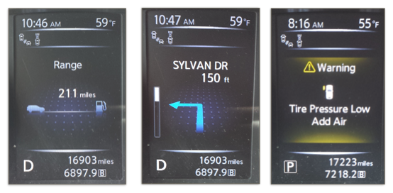
Automobile dashboards have evolved to focus on presenting and highlighting relevant information as opposed to a 100% fixed view. In my car, a 2014 Nissan Rogue, there is a small screen right in front of me that mostly just shows me how many miles I have left to drive before needing to get gas. However, if more useful information becomes relevant, a new view appears. For example, if I am using the navigation option, the screen changes to show the next instruction on the route. Or, if a tire suddenly has low pressure, a screen would appear to warn me of this and show graphically which tire was low. Thankfully, I don’t have to search for this information because I am driving and should be focused on the road. It just appears because it is what is most relevant at that time. I want my business data on my mobile phone to work the same way.
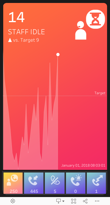
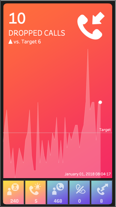
In a typical KPI dashboard, we see metrics lined up with an indicator of if they are up or down vs. target. Again, there is no easily discernible way to tell how that deviation is more or less critical to the deviation of the other KPI’s and therefore the one that should be paid attention to immediately.

We could add color to each KPI block to denote the impact of the KPI’s deviation drawing the eye to the Staff on Calls and the Dropped Calls:

But the user is still presented with the KPI’s in their same position, with the user reading left to right even though the most critical deviation in this case is on the far right.
In the typical “just make it tall” mobile mindset, this might translate to a layout like one of the below:

What if instead, our Call Center Mobile App just showed me what was most important at the time just like my car did? Again using our criticality weight from the lighting post, we can rank the metric that is most critical as the one to look at and make that the focal point. Each time you open or glance at the screen you are instantly able to interpret if there is anything that needs attention.


I chose to use Rank_Unique so there would be no ties for the mail screen focus, but of course, you could add additional weights to your criticality score, or create a layout that would allow for more that one critical metric to be the main focus at the same time. Interactivity could also be added to allow the users to pop-out one of the other metrics to see its timeline and details by clicking on it as per the below. There are so many options!

For the colors, I could have used the metric based background from my Ambient Widgets post, but chose to go an easier route for this example, instead just swapping out one of 3 background images based on the Max critical score at the current time.

Enjoy and have a think about the apps you use on your phone and why you like to use them. What makes them so addictive? Can we add those addictive elements to our dashboard design to drive engagement? Or perhaps the less evil route is is to make them more effective so we don’t need to feed the screen-time beast while still providing needed value and information? Stay tuned!