Lighting as an attentive attribute in KPI dashboards
/
About 3 years ago, I saw an exhibit at the deYoung of J. M. W. Turner.
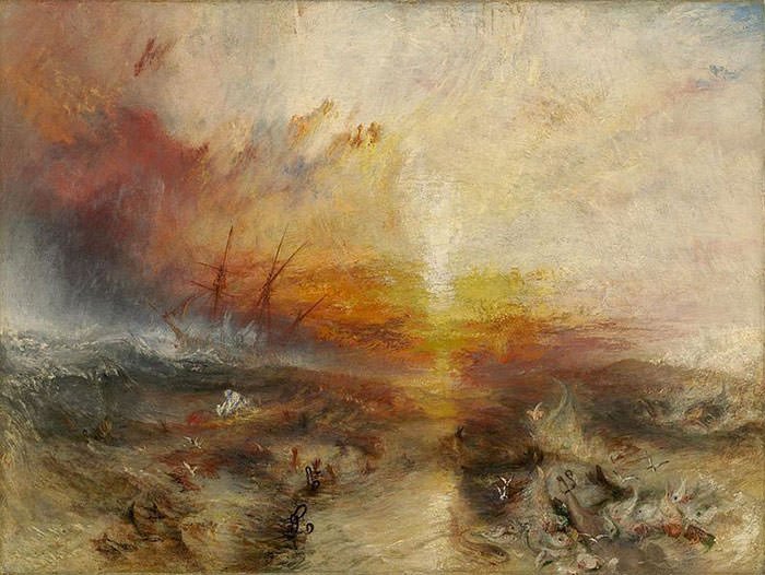
Slavers Throwing Overboard the Dead and Dying, Typhon coming on
I have been mulling over his technique of using broadly applied atmospheric washes of paint to draw focus and create intensity, and how to apply it to data visualization. We usually use the attentive attributes of color, size, shape, position, etc. to draw focus in dashboards.
I have been spending a lot of time pondering the UX of things not related to data viz and asking how to apply those design ideas to visualization work, as with my Widget post. Outside the sphere of data viz, in everything from photography, to video games, and interior design, lighting is a powerful way to draw focus and create emotion. I wanted a Marks card with a "Lighting" shelf.
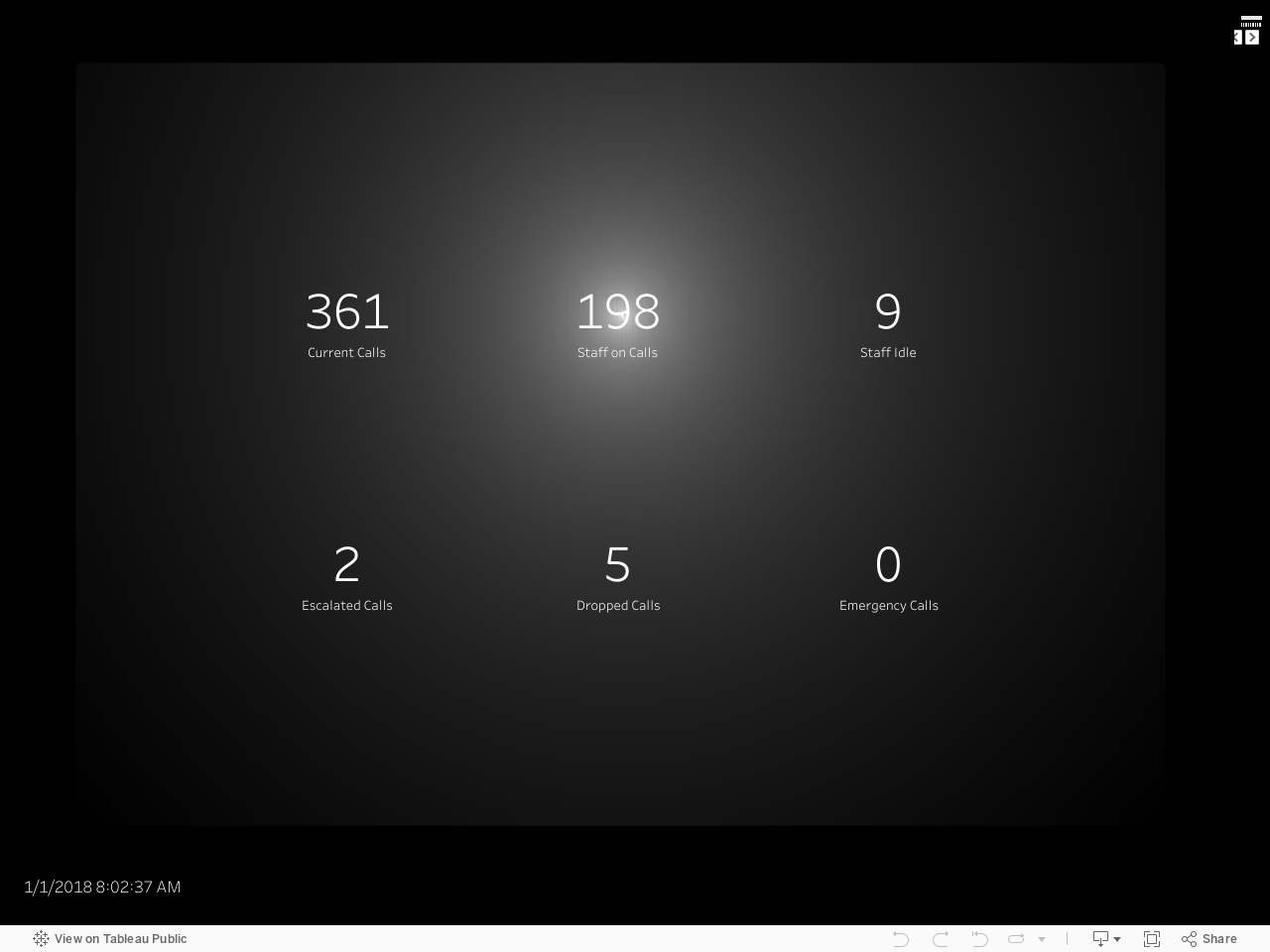
A standard KPI dashboard usually has numbers in bold as the top row, with indicators of if this number is good or bad and perhaps a trend over time.
While this provides a great overview of key metrics, I have no concept of the impact and relevance of the metric being up or down or off target a certain percent. A large variance in Sales may be very different in impact from a variance in InfoSec. Similarly, a dashboard with information on stock prices usually does not take into account the volume of the stock I own and the impact on my portfolio. I wanted to use ambient lighting to show this impact and relevance.
Using the call center data from the Widget post, I created a basic KPI view.

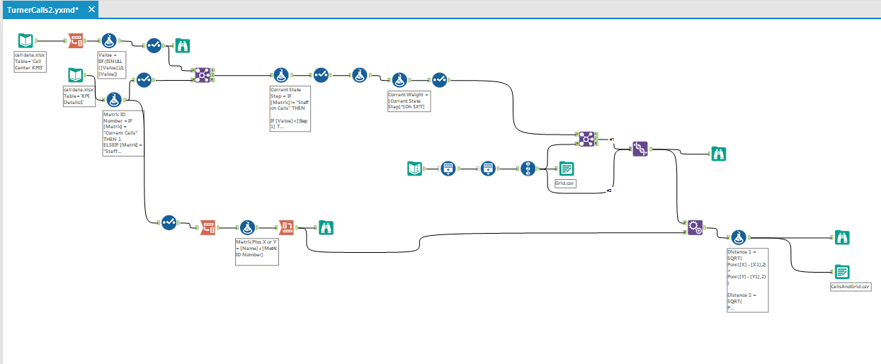
As the dashboard updates live, I wanted to add the ambient lighting to focus the eye on the KPI whose value was the most relevant at the moment. To do this, I compared the current value of the metric to it's expected value, and the magnitude of deviation from that expected value. These variances were then weighted by "dagnabit" (the working title was "Oh $#!t" but of course you are polite company so I changed it). This is a weight of the impact of this metric being off by a given deviation. The [value of the deviation] X [dagnabit] = the [Relevance of the Metric]. Each of these values had to considered relative to the relevance of the other metrics so that in the overall composition of the dashboard the ambient lighting would be applied proportionally. This involved a lovely Alteryx workflow and some Noah Salvaterra math-tastick-ness.
The background is a grid of 200 X 300 circles and each of these is colored by this weighted relevance from the center of the metric XY coordinate, radiating outward from white to black. the ambient lighting is updated every few seconds as the data is updated drawing the users eye in the composition to the metric of the most relevance.
If you are in desktop, here is the viz. If you are mobile - sorry, Tableau needs to be a bit more responsive :-p.
After all this, Noah had a brilliant idea to just do it with transparent gradient .png's that got larger with the [Current Weight] but we haven't got it to look quite as fabulous yet. Enjoy your new "Lighting" attentive attribute, as welkl as KPIs that now are weighted by relevance.
